Portfolio Website
arinvanderheyden.com
Case Study
Contextual Overview
The Purpose
The design, development, and launch for my personal portfolio website sought to not only serve as a means to showcase design/ development skillsets and online presence, but also address my interest in, and pursuit toward the space in which design and development intersect.
The Goal and Challenge
The overall goal for developing my own portfolio website from scratch was to gain an in-depth understanding of coding languages, obtain skills in JavaScript, HTML, and CSS, while simultaneously executing this knowledge to produce a real-world project highlighting my abilities and guiding me closer to my career pursuits.
The Project
The project spanned a 2 month time-frame from conceptualization through launch where I utilized the developer environment, tools, and best practices to configure, curate, structure, and style a responsive portfolio website for use across various devices and browsers.
-
Tools of the Trade:
- Adobe Dreamweaver & Atom text/source code editor
- Firefox & Chrome developer console & inspector tools
- Netlify (Deployment & CDN)
- Google Domains (Personalized domain registration & DNS hosting)
- GitHub Desktop & Owl Carousel (jQuery plugin)
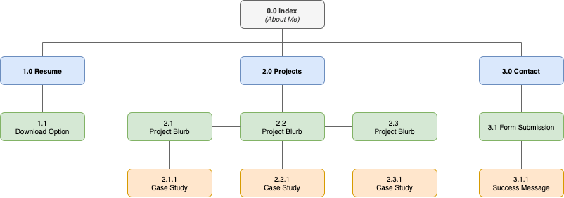
Sitemap
Page Hierarchy
Before diving into any development, to better convey the flow and purpose for my portfolio site website I outlined the page hierarchy in a brief site map to ensure all content was accounted for, that viewers will be directed from web page to web page, and that all were properly linked via navigation.
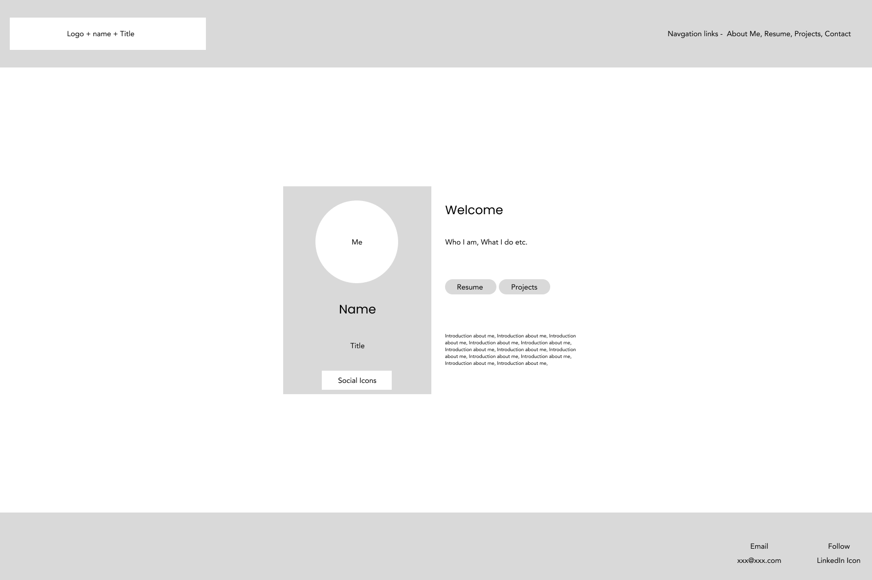
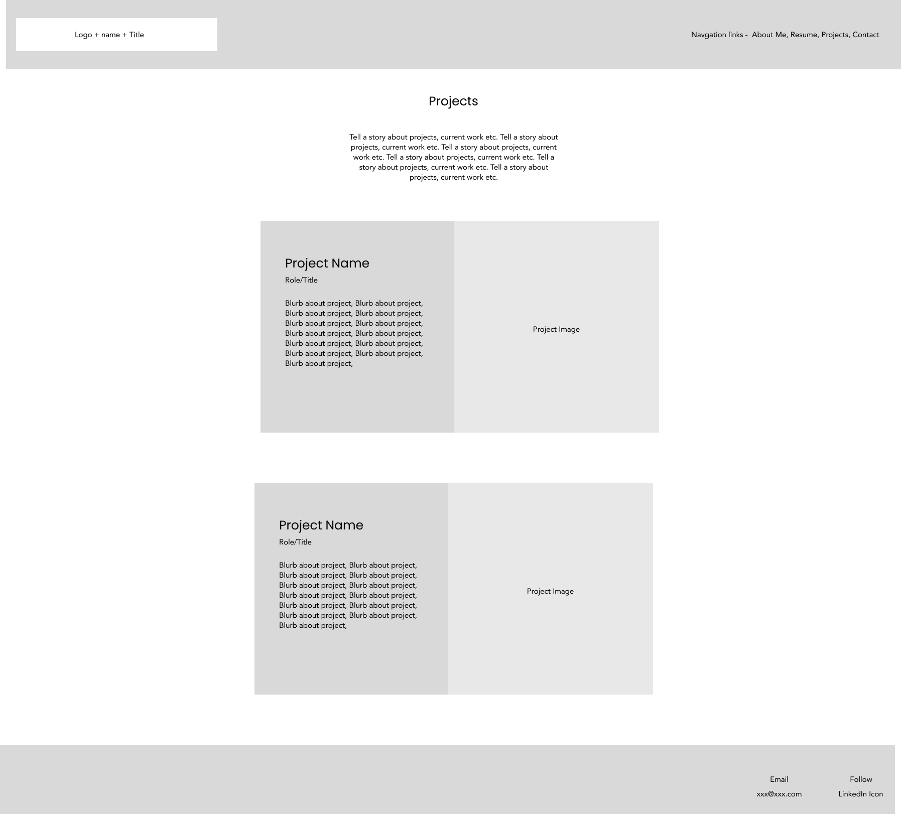
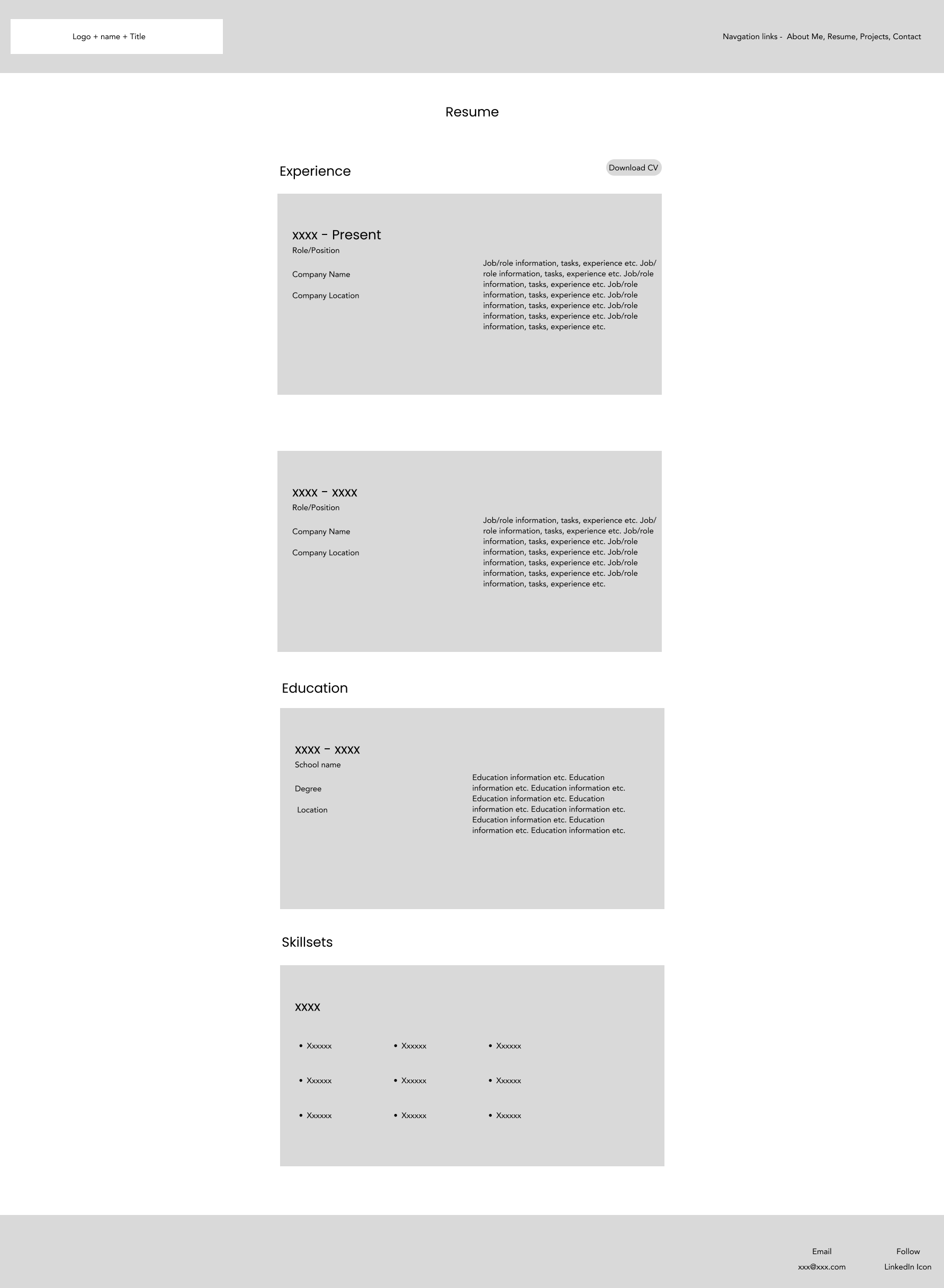
Wireframes
Visual display & site architecture:
Using the overall sitemap as a checklist for information flow, the architecture of my portfolio site - navigation, page organization, and user flow were brought to life in the form of wireframes. These tangible visuals devoid of color and font types offered an objective view at the website’s flow, hierarchy, navigation, and placement of elements, as well as exposure to any problems that stood out for specific features or in site architecture.
-
From a development perspective, wire-framing achieved the following:
- A solid design foundation to build from
- A visual understanding of what is to be built
- Clear understanding for content creation and overall function
- prevented major hick-ups futher in the development process
Design & Development
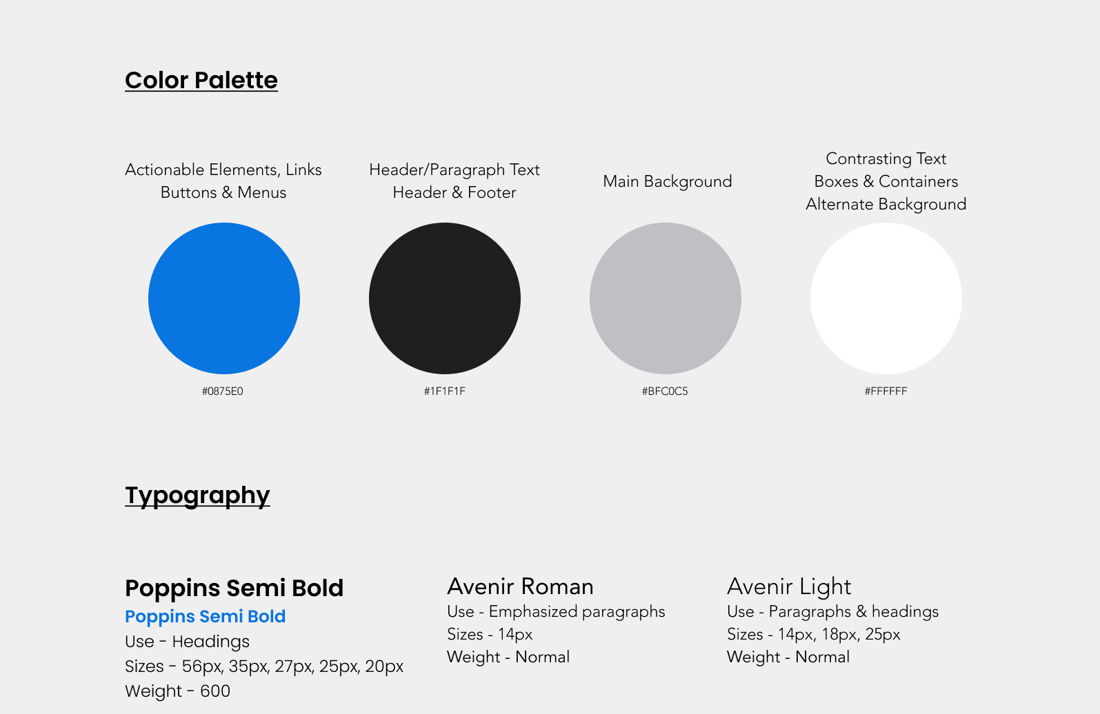
Stylistic Decisions Rationale:
Stylistic decisions behind the color palette and typography stem from that of neutrality and offered a clean, sharp look when viewed on a high quality device or desktop screen regardless of scale.
- Darker tones were adopted for the header/paragraph text and the crisp print type of both the Avenir and Poppins font styles displayed beautifully against either the main grey background or the alternative white container background.
- A soft blue tone was chosen for actionable elements, buttons, and menus which contrasted nicely against any of the background choices, the alternatives or in special situations such as the instance of the header and footer.
- Typography sizing was broken up into use categories:
- A bolded, larger font style, (Poppins Semi-Bold) for use against any of the chosen background colors,
- A combination of light and regular font styles, (Avenir light & Avenir) for use depending on the level of emphasis required.
Color Pallete
Logos
Logo Graphic & Text Variations:
Following my theme of visibility and contrast, two final designs were chosen utilizing each color variation within the branded color palette to ensure my logo/brand will always appear visible and consistently readable across various platforms in both a dark and light theme.
Dark theme
Light theme
Unique Content
In addition to standard content, two unique features were incorporated into the portfolio website having the following benefits:
-
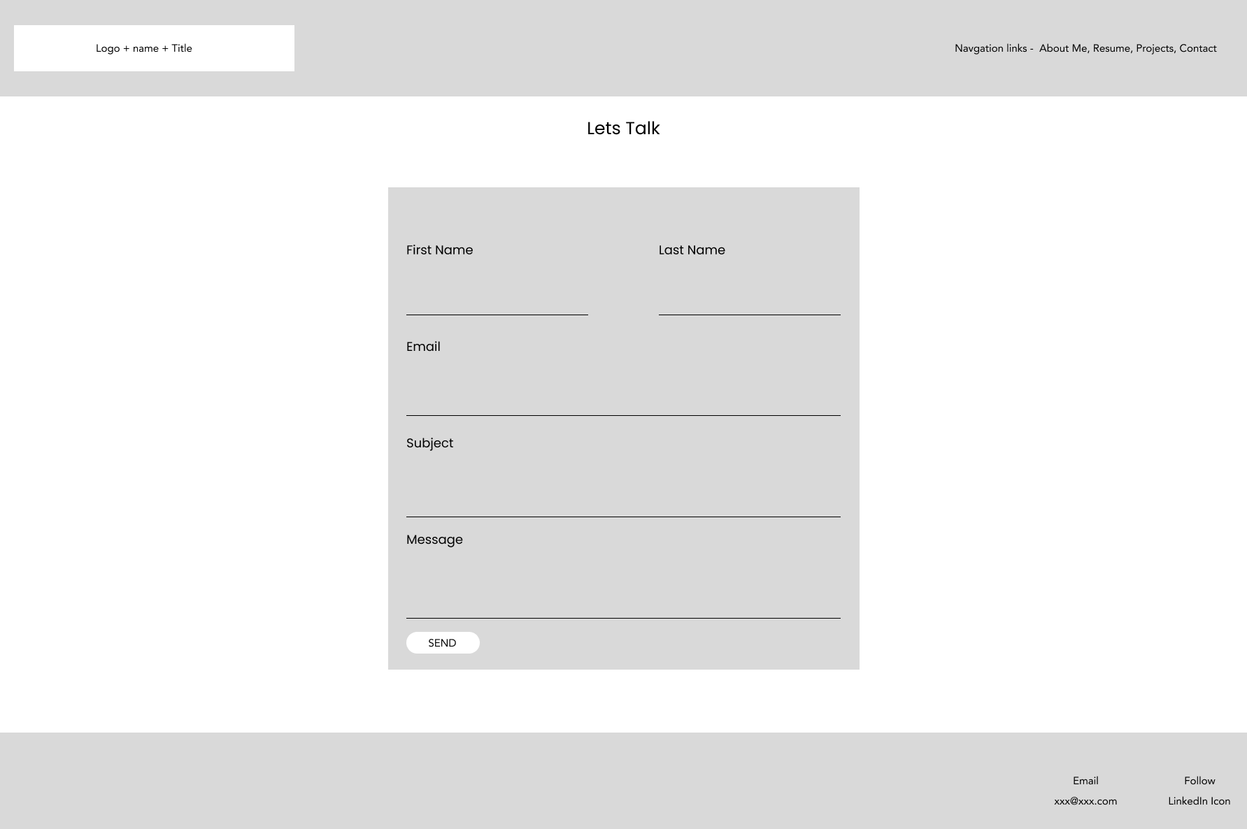
A dedicated contact page and input form:
- An easier experience for the user as opposed to switching between an email client and the website
- Take advantage of browser autofill features A dedicated resume page and download:
- Rapid viewing and/or obtaining a copy of my latest resume without having leave the site
- Rapid highlighting of work history, abilities, and skillsets
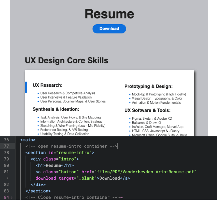
Resume page & download option
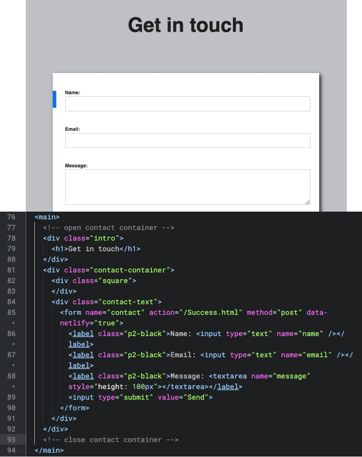
Contact page & input form
Code Quality
Validation & Linting:
Before testing the site across different browser types, it was necessary to ensure that the quality of each code type syntax used to build the website, (HTML, CSS, and JavaScript) were consistent, error free, and readable. To execute the code validation & error reporting process I utilized the static code analysis tool via Adobe Dreamweaver in conjunction with the default rule sets, (HTML: .htmlhintrc, CSS: .csslintrc, JavaScript: .eslintrcvia), and double-checked mark-up validity for each web document using the https://validator.w3.org tool until zero errors were returned.
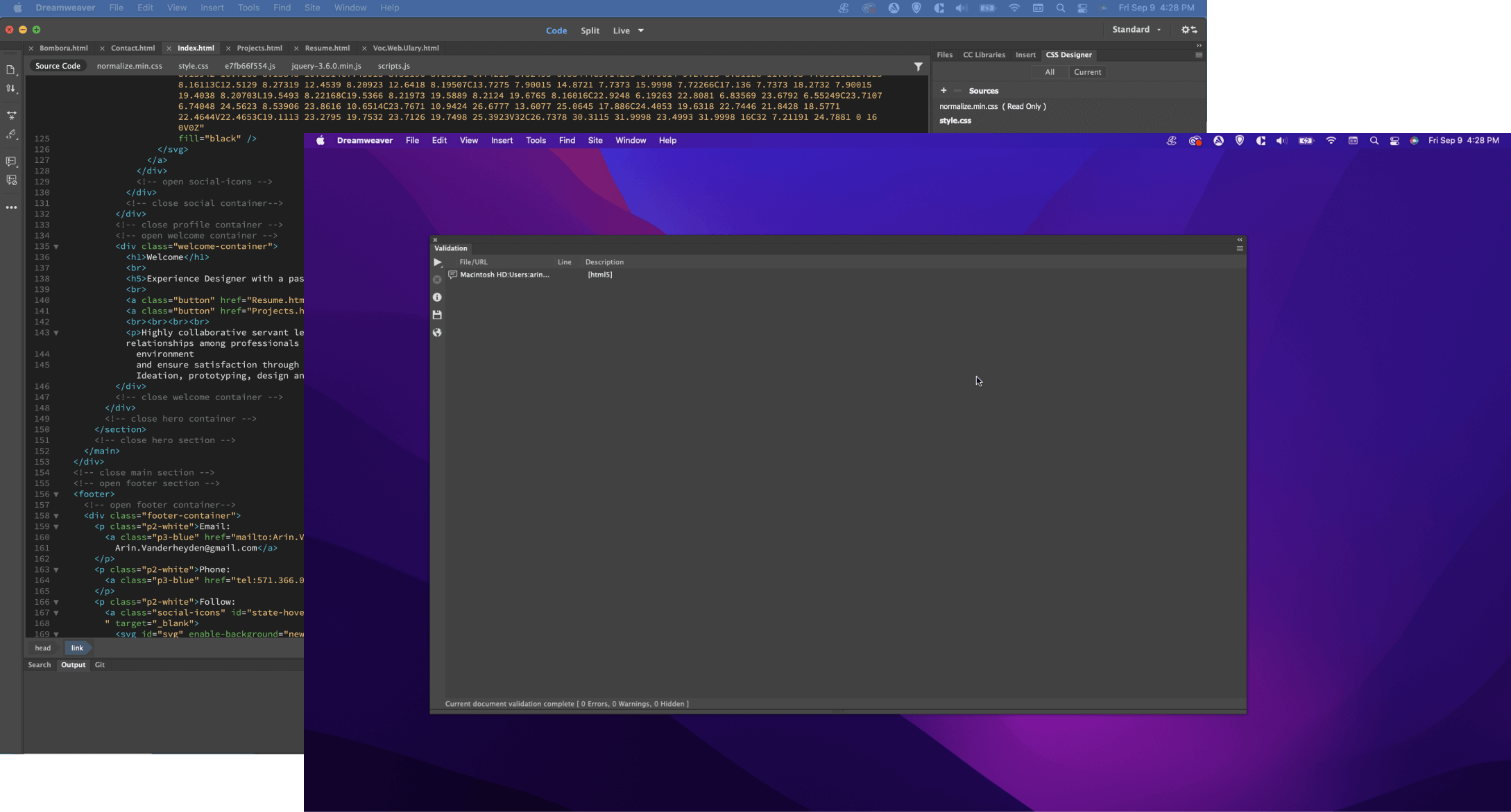
Example of HTML validation
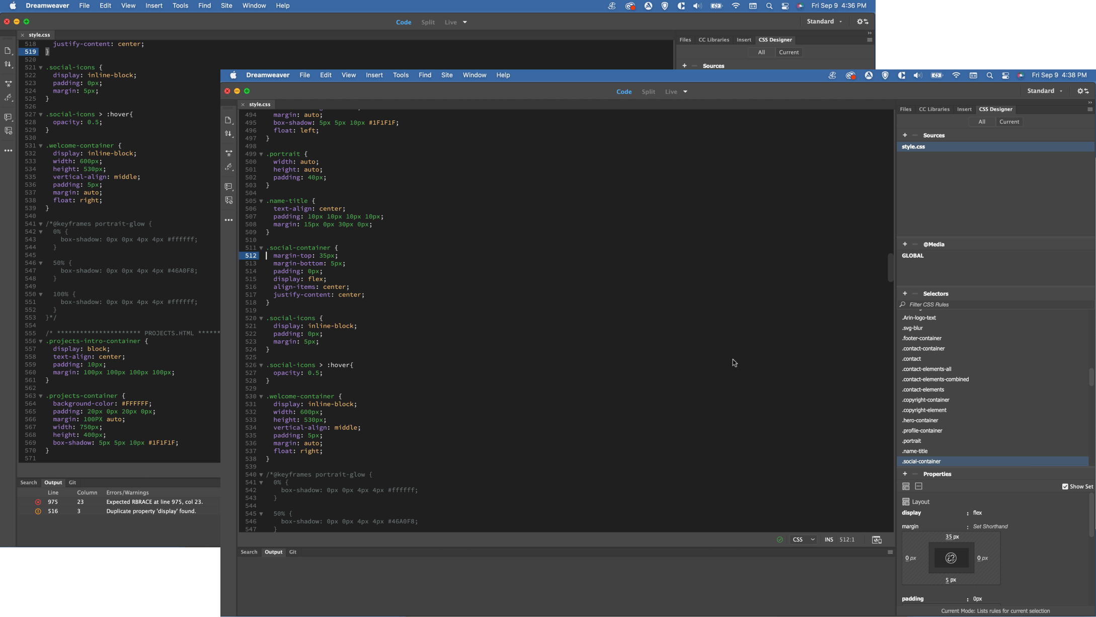
Example of CSS validation
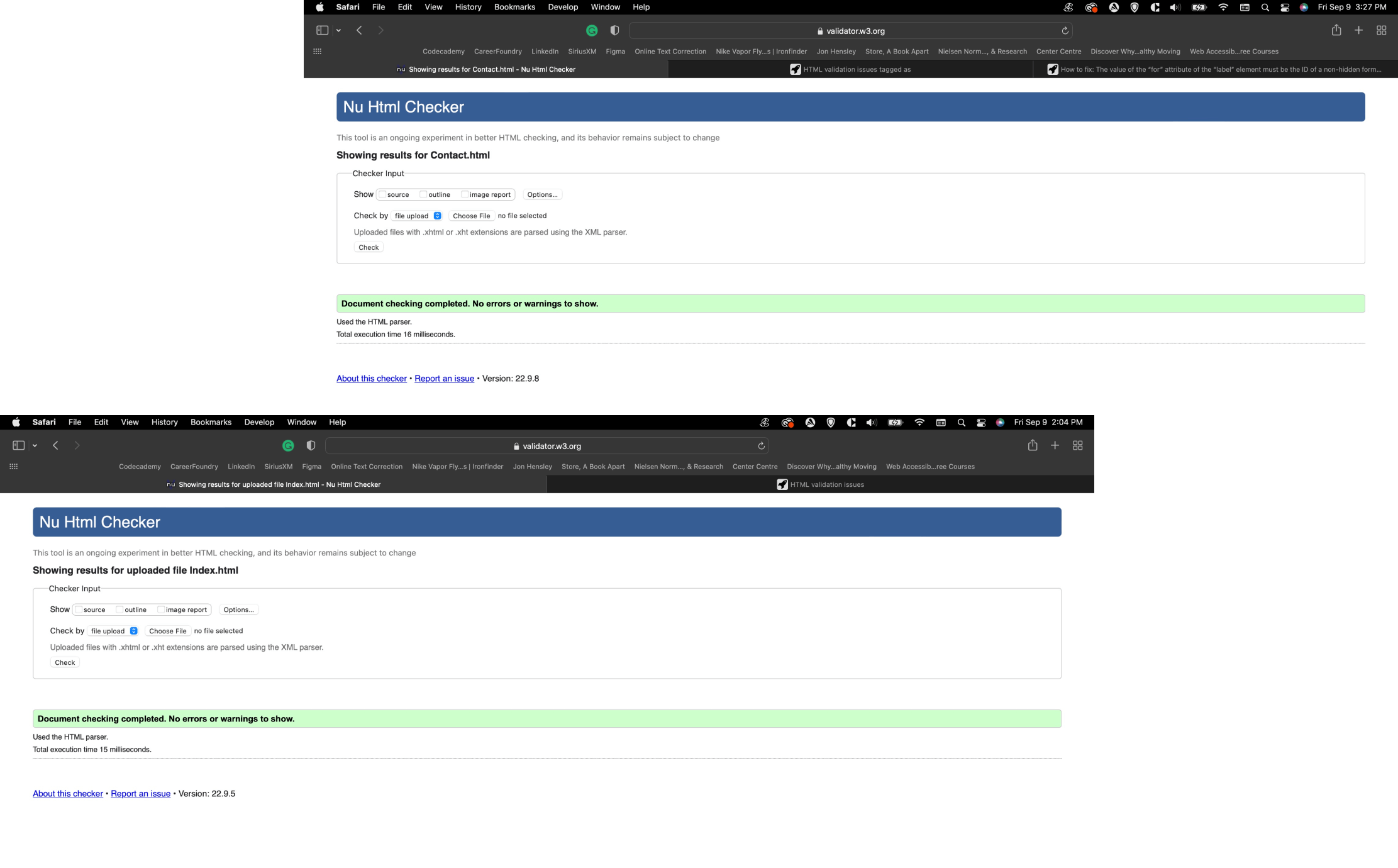
Example of W3C validation
Accesibility
Color check for accessibility:
All but one color combination passed the color check for accessibility being the #FFFFFF/#46A0F8 combination returning a contrast ratio of 2.75. In order to pass AA compliance, not deviate from the overall theme the lightness of the original #46A0F8 value was modified to #0875E0 resulting in a pass.
Responsive Design
Given todays multi-device society, the importance of appealing to both desktop and mobile viewers has increased across platforms. To ensure my portfolio site is viewable across as many devices as possible, breakpoints were established via CSS styling (media queries and flex display options) for different screen sizes rather specific devices as follows:
- Small screens up to 640px; including most mobile screen sizes
- Medium screens up to 1024px; including large mobile and most tablets
- Large screen sizes up to 1440px; including large tablets and most laptops/desktops
- Extra large screens up 1920px; for all larger screen sizes
Testing & Quality Control
Goal & Test Objectives:
To evaluate and assess the efficiency of the overall navigation structure, general functionality, readability, and UI, tests were conducted to gauge usability in the following areas:
- Engaging the target audience: overall appeal and degree of engagement with respect to content, navigation, UI, and use of language.
- Cohesiveness & ease of navigation: How efficiently viewers can move through the website and any pain-points encountered.
- Highlighting work & abilities: How quickly and easily viewers can locate and view personal work history and skillsets.
- Viewing/obtaining resume: How easily viewers can locate and obtain a copy of my personal resume.
- Contact options: How easily users can obtain contact information, bio, and links to social media activity.
Results
Future Iterations:
With usability testing complete results collected, the findings were evaluated using the rainbow spreadsheet method, evaluating their degree of severity, effort level, and sorted into two categories for future iteration:
- 2nd Iteration: Issues assigned an error rating of 3 or 4 which severely impact the functionality and/or usability of the website.
- 3rd Iteration: Issues assigned an error rating of 2 or below being minor or cosmetic only will be reviewed, evaluated, and implemented on a case by case basis.
Next Steps
Future Goals:
With the development work done and my portfolio site live on the web, continuing support and maintenance will be required. The mission from here on out will be to ensure the scalability and improvement of the initial site launch on future iterations to fix additional errors and bugs per earlier testing results, and improve and incorporate functionalities and/or features as I continue to grow my development skills.