Bombora
(bämˈbôrə)
Surf Forecasting
Overview
The Purpose
The design and development for the Bombora surf forecasting application sought to address a unique need among a tight-knit, surf community requiring a new type of mobile weather forecasting application that was more than “just another weather app”, but a reliable tool that focused on individual surf styles, skill levels, and personal preferences.
The Goal
The goal was to design a simplified application focusing only on the information necessary to help surfers better understand how closely their individual style, personal preferences, and skill level compared to the weather conditions in ocean environments so they can make more informed decisions to better utilize their time on the ocean and achieve their athletic goals.
The Project
As part of my curriculum studies, and filling multiple roles along the UX spectrum, I utilized a range of industry tools and core skills, to conduct research, synthesize ideas, conceptualize, and refine designs to produce a complete, working prototype for Bombora in a 6-month time frame.
Scope
Mobile-first design + web-app interface
Role
Full-spectrum approach - UX research, ideation, prototyping, and design
Timeframe
6-Month span from inititation
Tools
Figma, Sketch Balsamiq, and Draw IO, InVision, Craft Manager, and Marvel App
Discovery
The Challenge
To better understand the challenge, thoroughly defining the problem was essential. By focusing on these contributing factors and explaining them in the form of a concise problem statement, I was able to gain initial insights into what the needs and goals of my users might be, the origin of these needs, and how I may approach potential solutions and by what criteria I am able to measure their success.
Defined Problem Statement
"Surfers need a way to quickly and accurately forecast weather conditions to determine whether an ocean environment is suitable to their current skill level and is safe to engage in water activities."
Potential Problems
As a starting point to guide the future design, several presumptions were made to identify any potential underlying problems users may experience when attempting to carry out any of the tasks established in the overarching problem statement as well as any possible solutions which could be investigated further to solve these problems. The following context was established:
Inaccurate
Inaccurate, outdated, or unreliable weather and oceanic data
Limited Functionality
Limited functionality in remote costal areas with little to no wi-fi signal
Complicated
Complicated, confusing and/or unintuitive user interface
Potential Solution
Design an app that provides to-the-minute weather forecasting, oceanic, and synoptic data accessible with or without a wifi signal. Design an interface that is easy to use, interpret and understand including an in-depth explanation of all features and functions.
Competitor Analysis
When considering how Bombora may fair among existing applications already established in today’s market, various social media platforms, discussion forums, and community websites centered around surfing were explored to assist in identifying two of the leading surf forecasting applications claiming to serve a similar purpose to that of the problems I was looking to solve being Magicseaweed and Surfline.To fully vet the two products, a competitor profile was created for each application highlighting numerous app strengths and weaknesses, potential threats, and a variety of competitive advantages (opportunities).
Competitor Profiles
Magic Seaweed
Strengths
- The app is well known being the first of its kind
- Is popular and has a large following
- Its data is used at popular surf events
- Provides coverage for 3,000 beaches in 180 countries
Weaknesses
- Forecasting radius is general to an area
- Nearby spots are general predefined forecasts
- Local/personalized conditions are largely ignored
- No real instructional content to "become a better forecaster" as claimed
Magic Seaweed
Opportunities
- Understanding data is a personal expectation and needs managing
- Provide instruction on reading synoptic charts
- Upgrade the help section, define terminology and explain features
- More accurately display wave height ranges (Refer to the Bureau of Meteorology marine forecasting)
Threats
- Online reviews claim wave data is too general and other apps’ height estimations are more accurate
- Reviews state other forecasting apps allow personalized filtering of preferred conditions
- Live cams on other apps work much better
- The Spot Advisor app has done away with media content by focusing more on connecting users with each other to report and confirm forecasts
Surfline
Strengths
- Has a loyal following and an extensive history in forecasting
- Impressive UI and intuitive layout
- Values its user's end experience
- Largest selection of live surf cams on the market
- Written reports by forecasters are a plus
Weaknesses
- App relies heavily on the live cam experience (Subscription for HD cams)
- Too many ads on the free version
- Same information as other apps, just presented in a fancier way
- Some controversy exists around Surfline promoting product features with the sole purpose of drawing customers
Surfline
Opportunities
- Include instructions on how to read the animated wind charts
- Balance between future prediction and real time live cam
- UI is quite intuitive, could use as a design inspiration for Bombora app
Threats
- Reports suggest Surfline’s cams have contributed to increased pollution by drawing large crowds to once pristine beaches and locals have been known to destroy Surfline’s cams to protect them
- Several user reviews suggest using Surfline’s cams in conjunction with other apps for better forecasting accuracy.
- The Lazy Surfer app is making a splash in the market by personalizing the experience with features tailored toward individual condition reports
Definition
Research
To confirm whether the user goals and usage context remained in alignment with the established problem statement research was conducted leveraging surveys enabling me to reach a large audience via social media, and served as a basis for subsequent user interview scripts. Facilitation of user interviews with individuals qualifying as "a surfer having used a weather forecasting app to determine when to go surfing" enabled me to ask open-ended questions based on real-world experiences to assist in extrapolating participants' reasoning and root causes around specific pain points they'd encountered when using such applications.
Research Goals
For the above mentioned research methods to be effective and yield viable results, four main user research goals were established which set the foundation on which the survey content, user interview script, and questionnaire were based.
Validate Objectives
- Affirm essential requirements & features
- Gain insight into product context & community
Understand Users
- Thoughts & feelings around users’ experiences
- Typical workflows & areas of frustration
Obtain Quantifiable Data
- Evaluate assumptions to underlying problems
- Discover new information relevant to the product
Engage Conversations
- Get to the “why” behind users’ needs & goals
- Substantiate root causes to existing problems
Research Insights
Both the survey content and user interview script/questions were carefully formulated to address the specific areas of context and workflows for weather forecasting applications used in the surfing community. Qualitative data obtained from both the studies was then broken up into six distinct categories where affinity mapping techniques were applied to arrange the information into respective groups by category.
Affinity Mapping
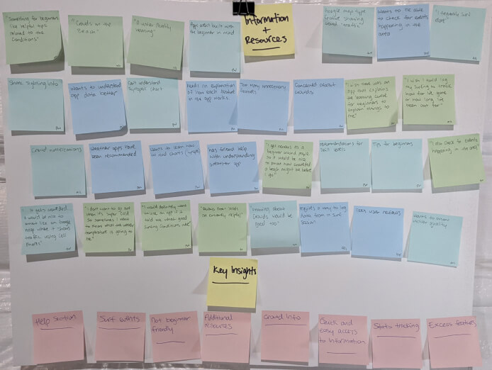
Information & Resources
Participants voiced the need for additional features they believed would be important in an app such as tips for beginner-level surfers, information on crowds, events, and water quality updates while eliminating excess features users deemed unhelpful. A help section and/or links to external references may prove beneficial to assist users when interpreting data and charts in order to utilize these features to their full potential. All participants indicated they valued quick and easy access to information.
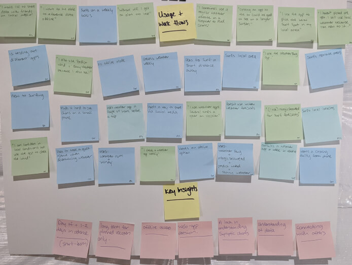
Usage & Workflows
Users consulted a weather application on the day of the activity and/or 1 - 2 days prior given they all surfed local spots near their residence and only used long-term forecasting if they were planning a vacation or trip to a different location. Interest in offline access was expressed although the need for this appeared to be limited due to the frequency of which participants found themselves in a remote location without a signal. Participants indicated they’d like to use different features but due to limited understanding, they only stuck to familiar features. Lastly, only one participant voiced a need to connect with others via the app.
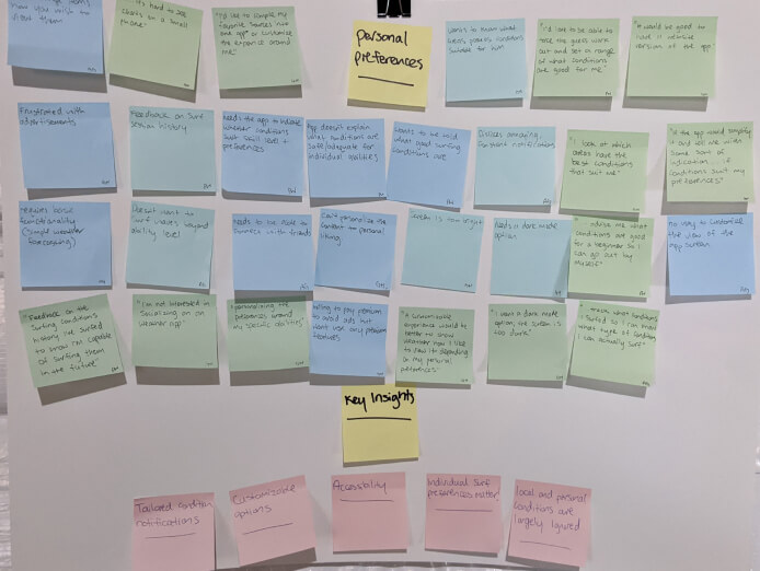
Personal Preferences
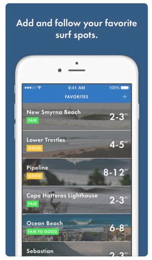
Several of the pain points discussed revolved around personalization items such as a lack of customizable options and personal preferences, difficultly reading charts on small devices, and often having to refer to a combination of weather apps to get a real feel for true surf conditions. Participants voiced the need for an area where personalized settings can be entered into the app in order to receive advanced notifications when weather conditions aligning with their preferred surfing styles were upcoming.
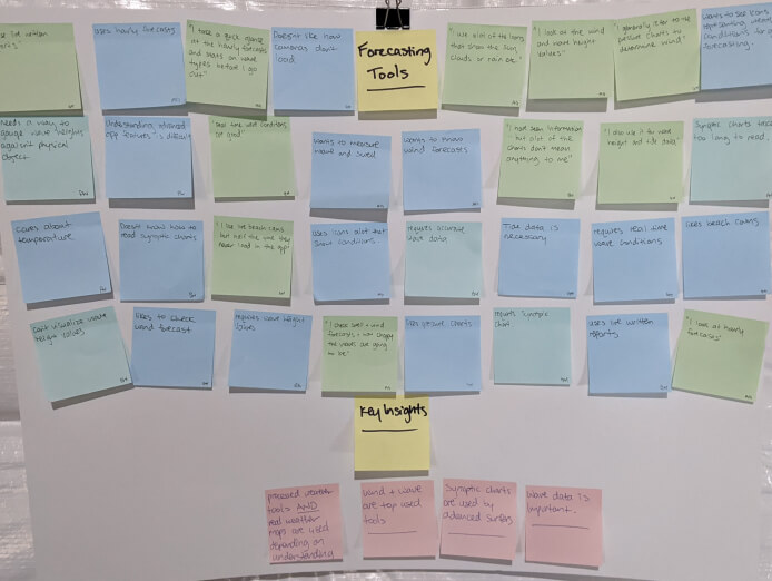
Forecasting Tools
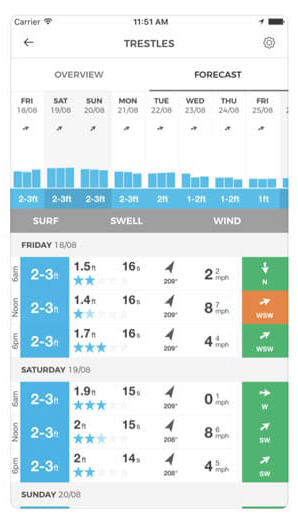
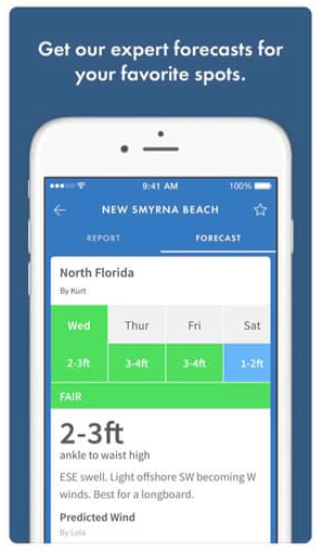
Of the current features offered in existing weather apps, those used most often were wave, swell and wind forecasting tools among surfers of higher experience levels referring to written forecasts and/or synoptic pressure charts over other tools. High importance was placed on wave data and all participants indicated they referred to a wave feature before entering the water. Results also showed how different forecasting tools are used depending on the surfers skill level and their degree of which they understand the data being presented.
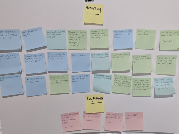
Accuracy
Of the top forecasting tools used, the biggest complaint noted was the inconsistency in the accuracy of wave height information. Participants went into further detail indicating additional flaws such as delays in real-time weather, live cams being overkill, or the wave height and swell data being exaggerated or underestimated. Those with an understanding of both real-time synoptic charts and the forecasting tools which process weather data into an easy-to-understand format pointed out the vast differences they often encountered between the two methods.
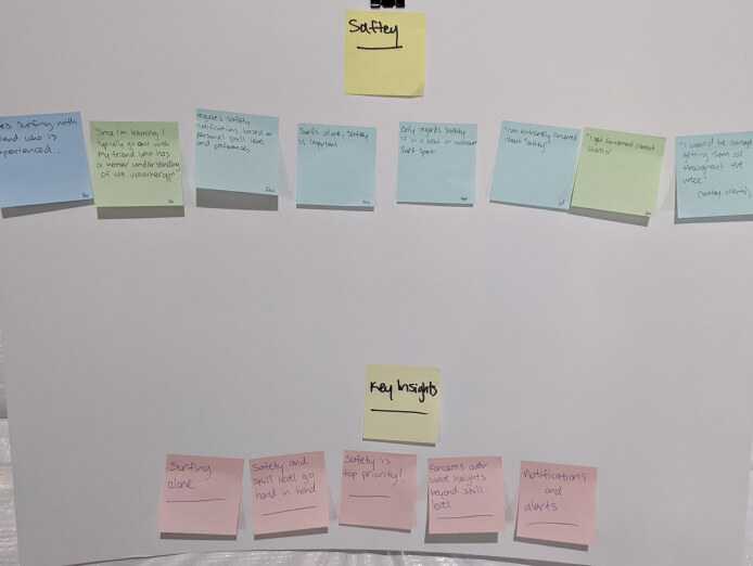
Safety
Safety was a top priority for all participants especially if they were visiting an unfamiliar surf spot or when surfing alone and all indicated they’d regard safety alerts if they weren’t pushed out in an excessive manner. Participants discussed how they used features in a manner that specifically suited their personal needs by referencing information that instilled confidence that conditions were safe and adequate for their skill level and valued data that accounted for their individual abilities.
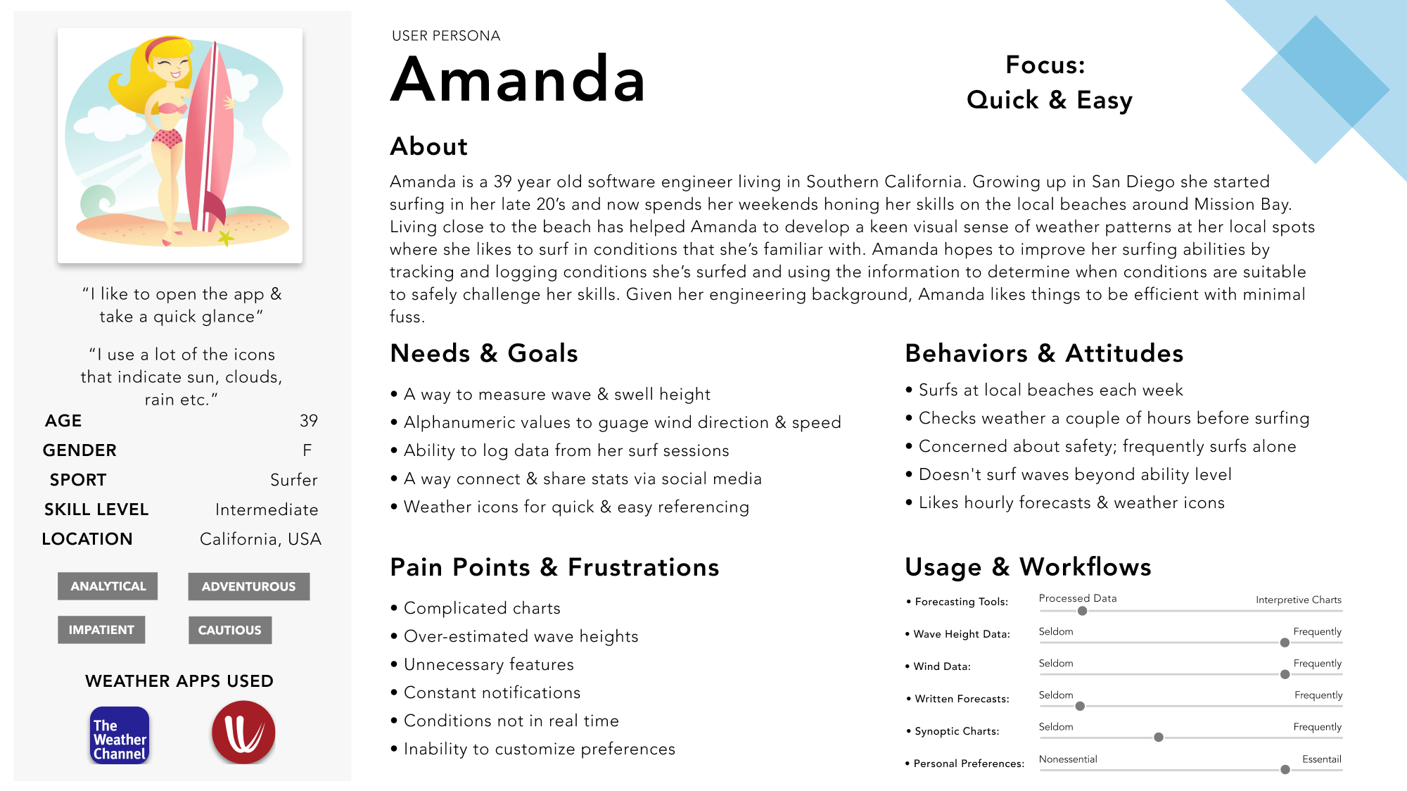
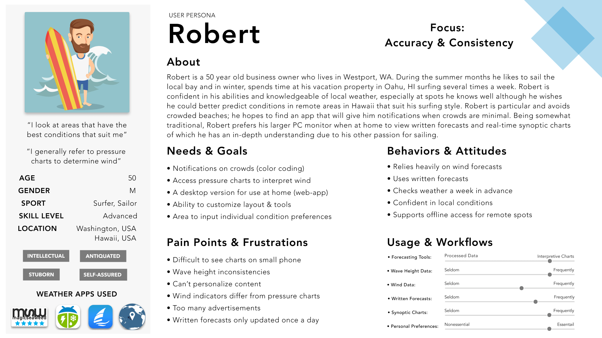
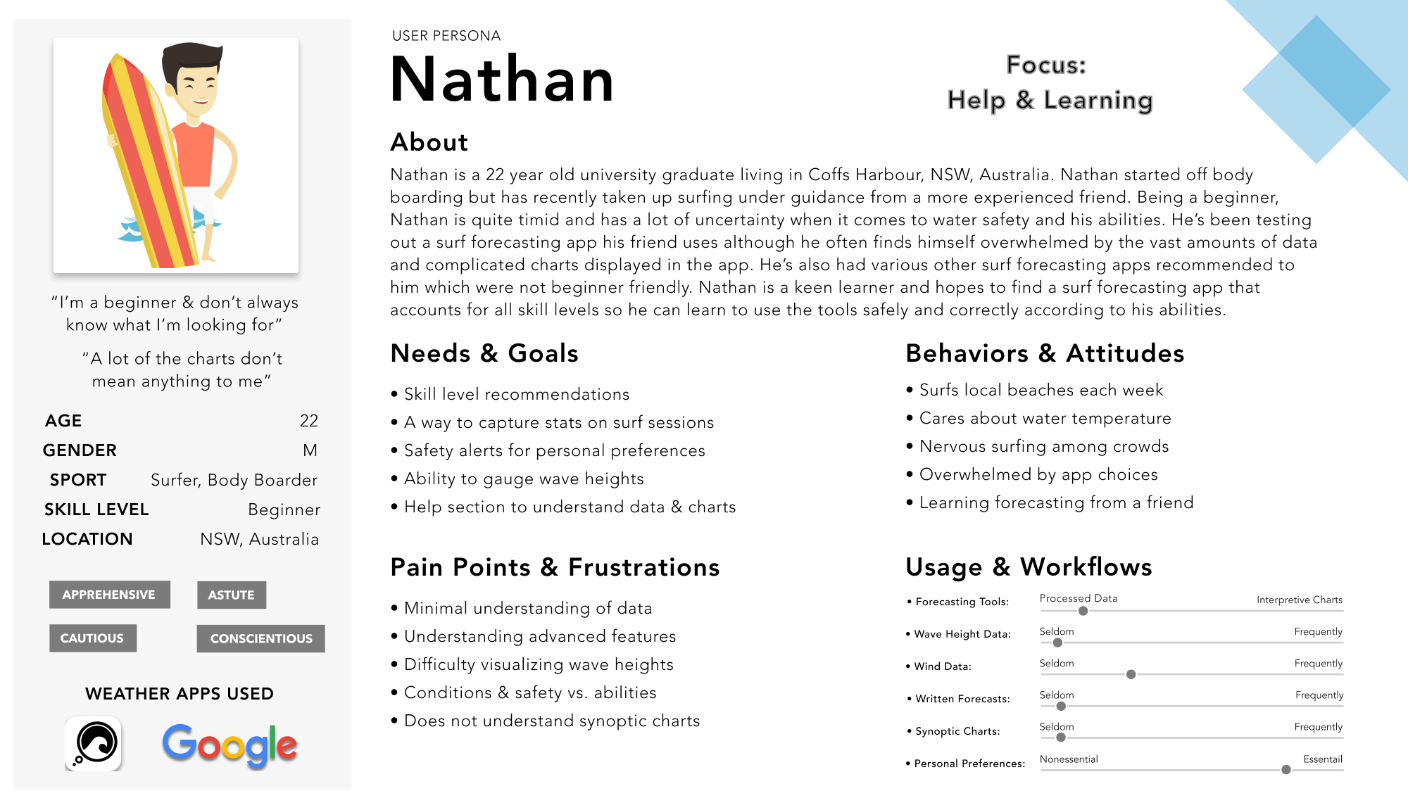
Design Personas
To better communicate research the insights obtained from real surfers, design personas were created to tell a more personal story as to why and how surfers interact with and use weather forecasting applications from their perspective. Three personas were developed representing each of the main user types that stood out during analysis focusing around skill level, usage type, and the degree of understanding in surf forecasting. 4 main focal points were established when defining persona content ensuring a user-centered approach throughout the process:
Institute Empathy
View the product through the lens of the persona and make decisions with their goals in mind.
Understand Objectively
Full-spectrum approach - UX research, ideation, prototyping, and design
Prioritize Functionality
Rank importance of functions and define those which are best prioritized for implementation.
Respect Real Data
Make design decisions based on real users’ needs and goals as the top priority.
Personas
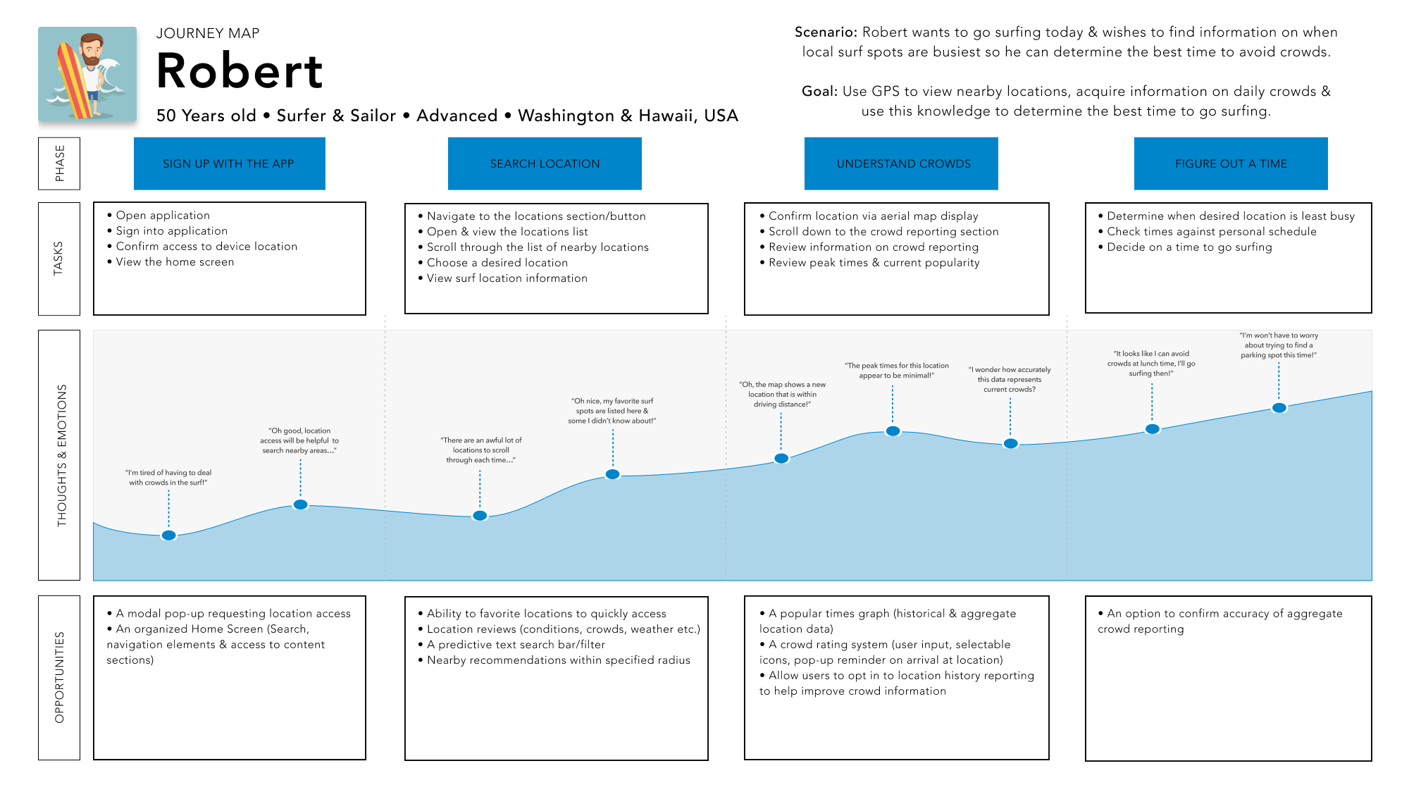
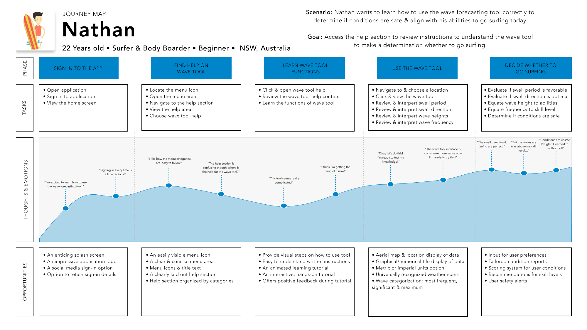
User Journeys
Using prior research as a base for extracting some of the most important goals, habits and behaviors exhibited by users, journey maps were created to better visualize the thought processes different user types engage in to accomplish their goals. By establishing important sections within the journey maps such as the scenario, goal, task, opportunities, and any surrounding thoughts and feelings, a visual narrative demonstrating a complete and cohesive story made for a deeper means of understanding users.
Journey Maps
Development
In preparation for the information architecture phase it was necessary to take the variety of user persona perspectives and begin fleshing out the possible in-app paths individual personas may take to achieve their specific goals and ensure no matter what the their need, an action was available to accommodate it.
Ideation
In preparation for the information architecture phase it was necessary to take the variety of user persona perspectives and begin fleshing out the possible in-app paths individual personas may take to achieve their specific goals and ensure no matter what the their need, an action was available to accommodate it.
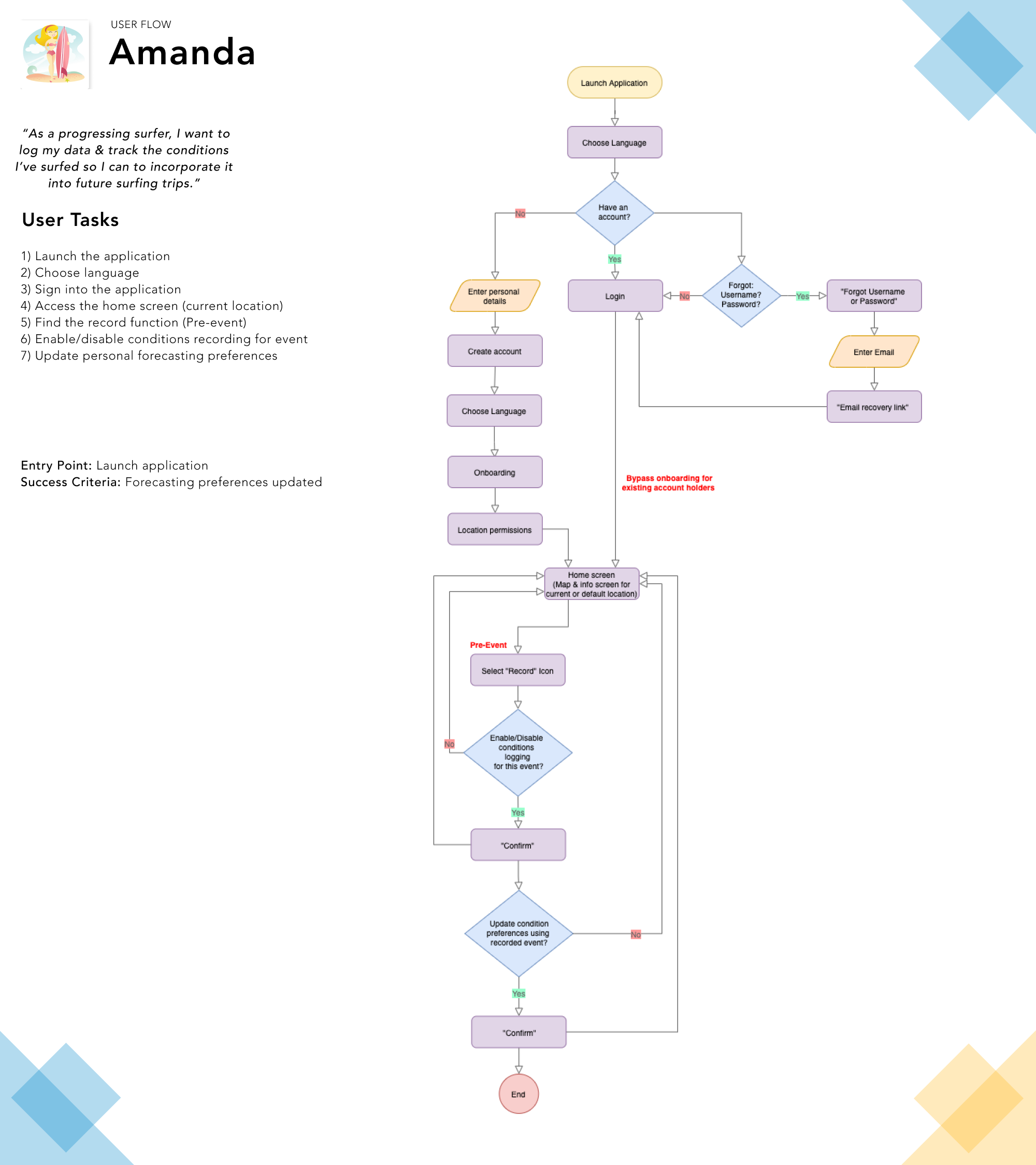
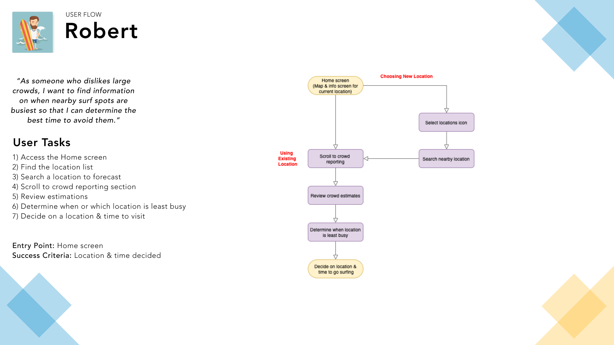
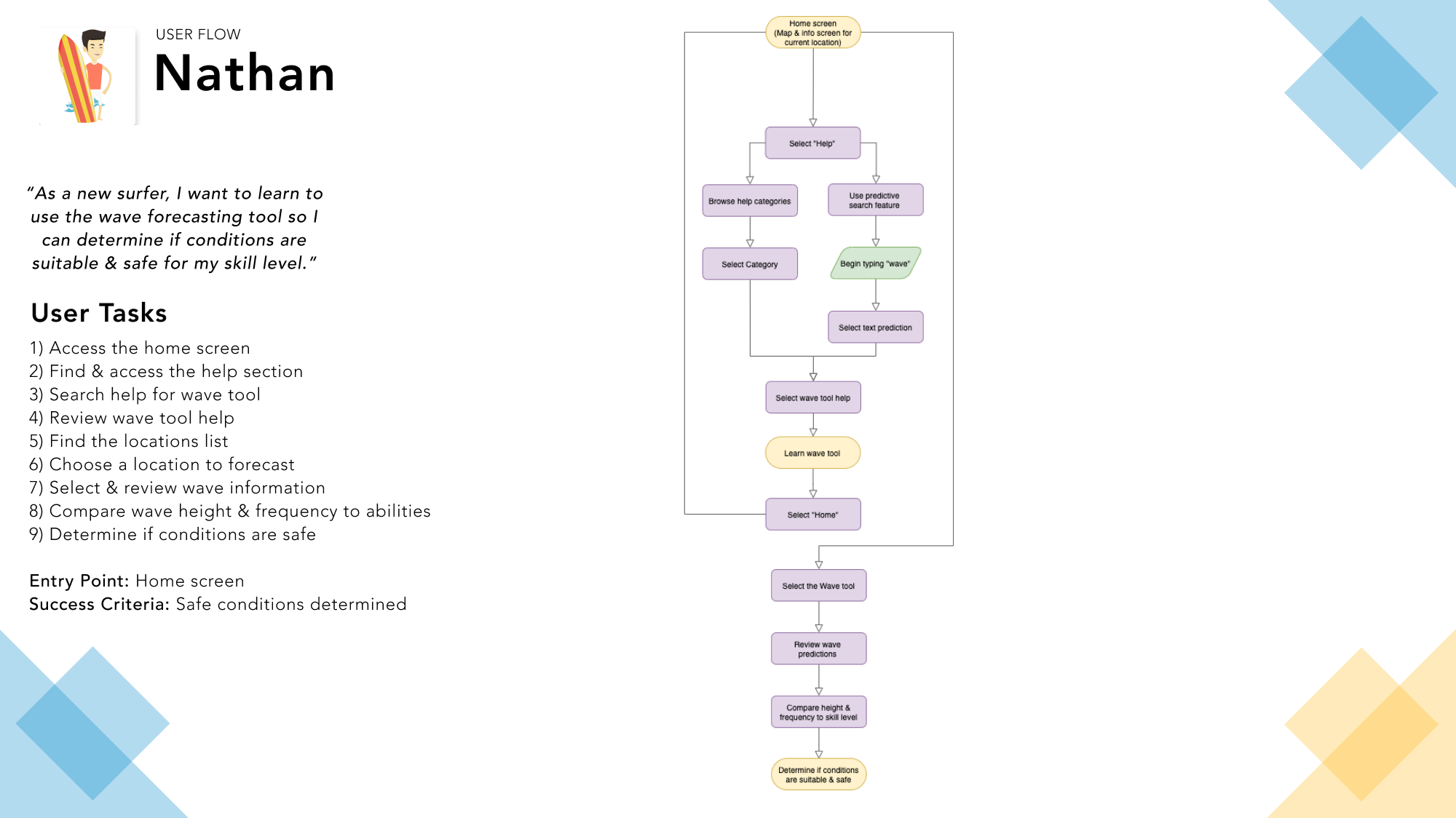
Task Analysis & User Flows
Using the context from each design persona as a guide, 3 of the most important user goals and steps required to complete the tasks were analyzed then outlined with respective entry points, criteria for success, and simplified into as fewer steps as possible without deviating from the needs of each persona. Subsequently using the information derived from the analysis’, flow diagrams were created to better visualize specific steps required to complete the objective from the users point of view and ensure the personas needs were fulfilled at each point in the user flow.
User Flows
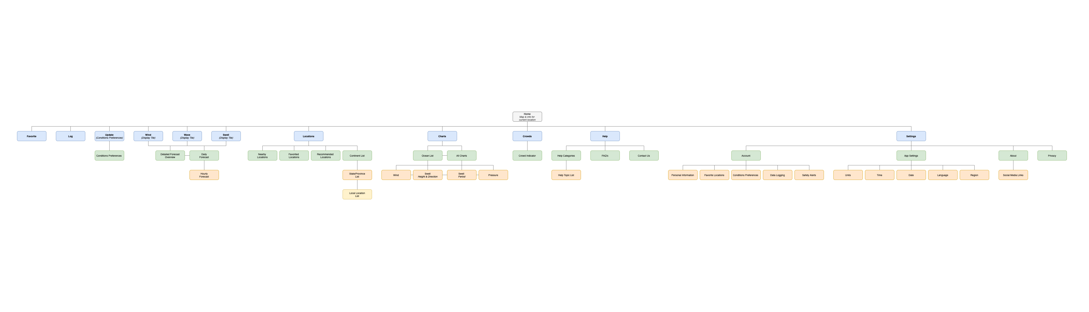
Information Architecture
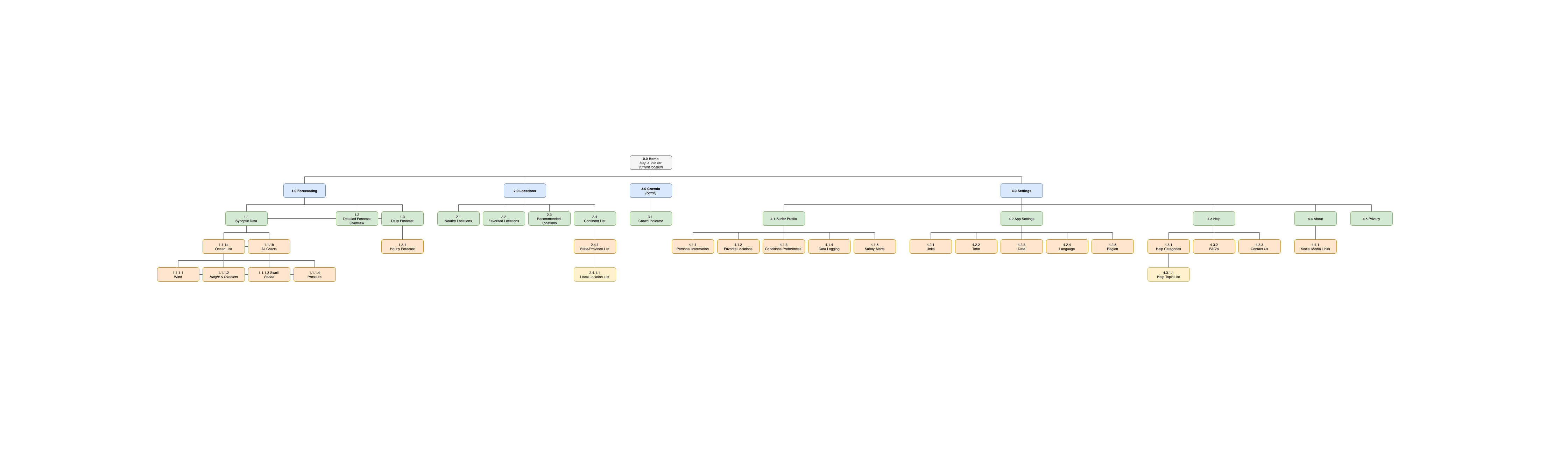
To better understand the nature of the application in its entirety a visualization for the overall information architecture and type of content contained within was necessary. With influence from the prior user flows a base structure was laid out in the form of an overall sitemap containing all determined screens demonstrating a first pass on how the various levels of hierarchy within application might be connected and their relationship to one another.
Initial Sitemap
The initial sitemap was based upon a strict type of hierarchy where user navigation stemmed from the main home screen with each new parent screen initiating a sequence of subsequent screens (children) relating to its content. One exception occurred where a coexisting type of hierarchy was used where switching between the tabbed screens for individual synoptic charts made for an easier transition between the four types available.
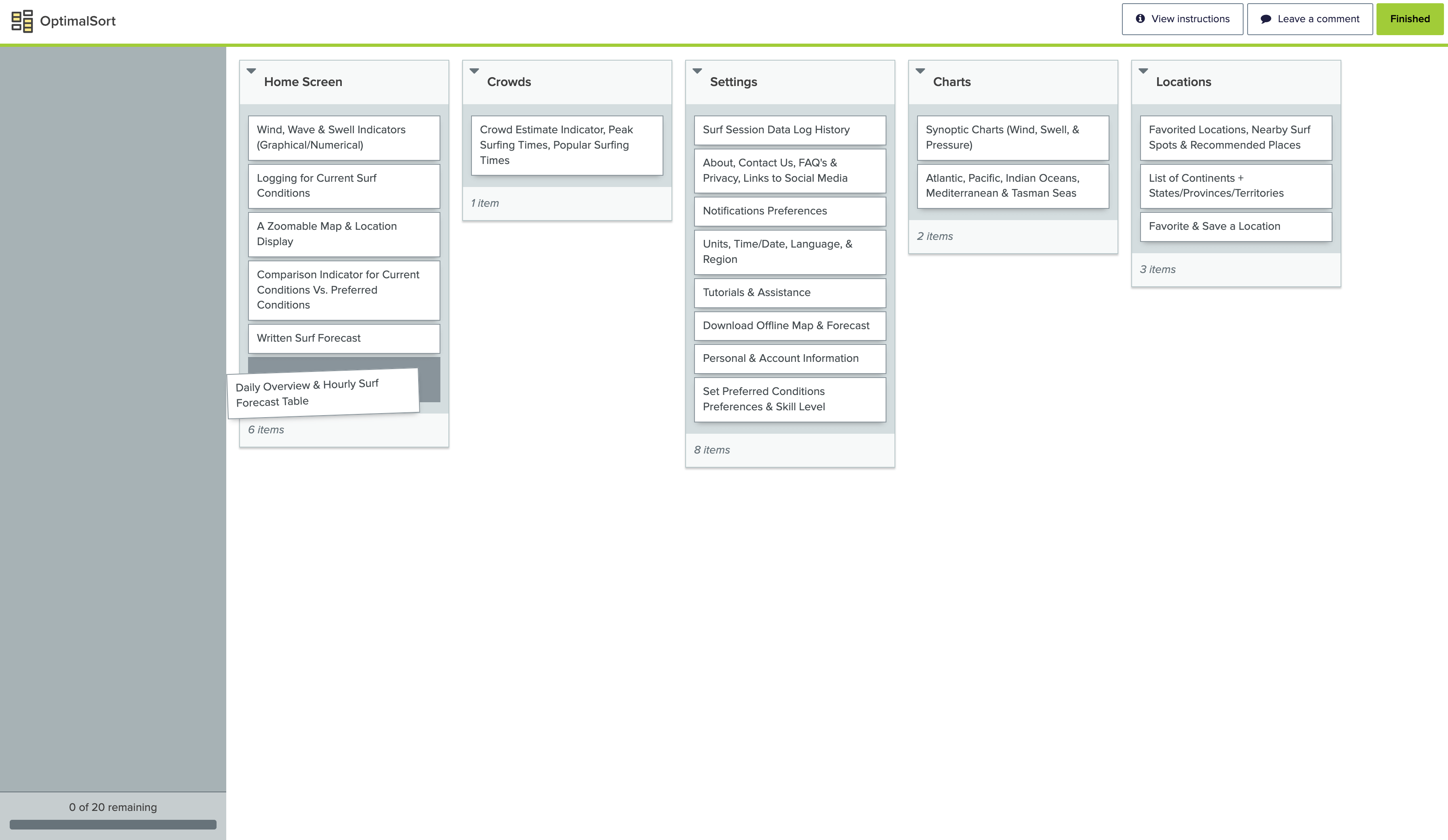
Card Sort & Refinement
With a first pass sitemap completed I needed to refine it based on the intuition of real users. To obtain data from a vast audience I conducted for an online card sorting activity using OptimalSort. Confident in a set of predefined categories I opted to proceed with a closed-type card sort where participants were asked to group specific surf and weather related content into said categories. Upon concluding the activity, results/metrics were downloaded, sorted based on their related topics, analyzed for recurring patterns and emerging trends, and a revised sitemap created to suit.
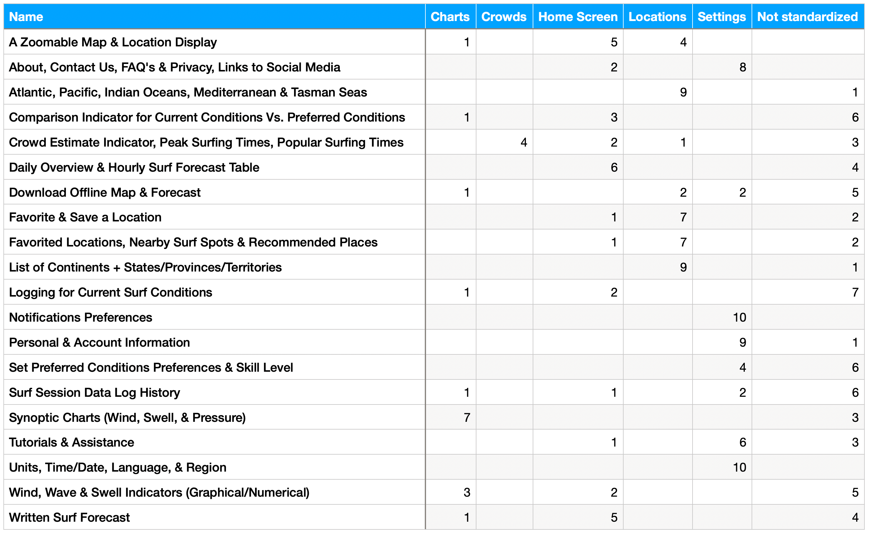
Standardization Grid
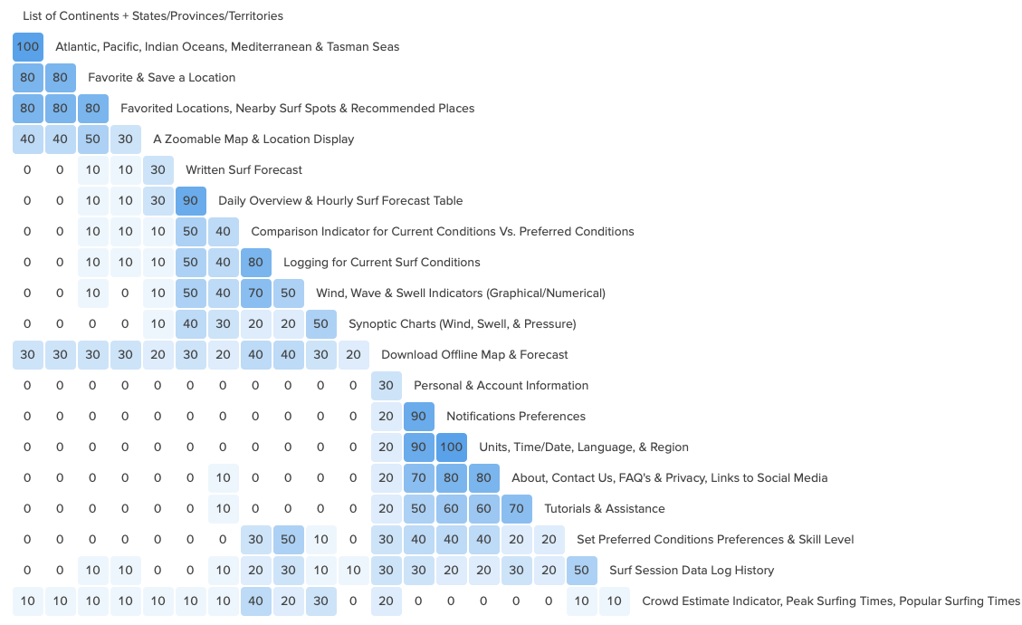
Similarity Matrix
Revised Sitemap
Rapid Prototyping
Using the revised sitemap as a guide to learn what the base functionality for both the application and web version might look like, it's content, and the screens on which content was to be displayed a set of hand-drawn sketches were drafted using transparent wax paper to represent the screens per the sitemap. To avoid wading too deeply into details, color, size, spacing, and imagery were ignored and the completed sketches were cut to size, arranged, and overlaid into different combinations to portray, from a high-level perspective, the design functionality as low-fidelity prototypes showing different user flows and interactions.
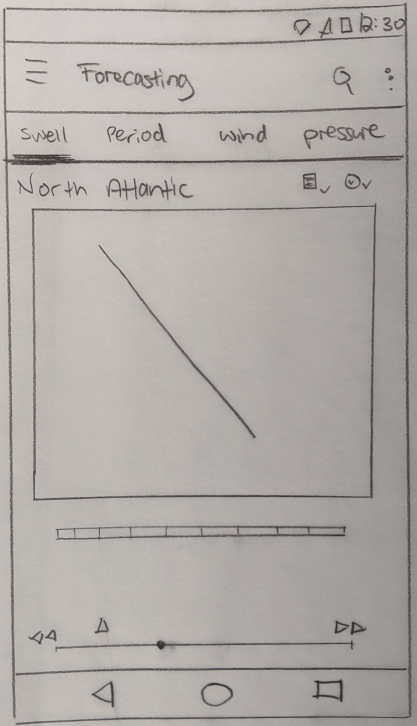
Low-Fidelity Sketches - Mobile Version
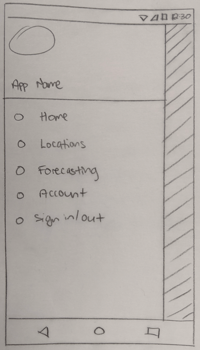
Side Draw Menu
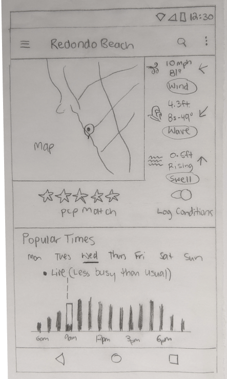
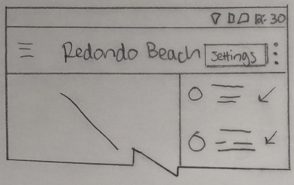
Home/Forecasting Screen
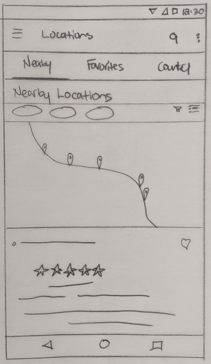
Locations Screen (Map)
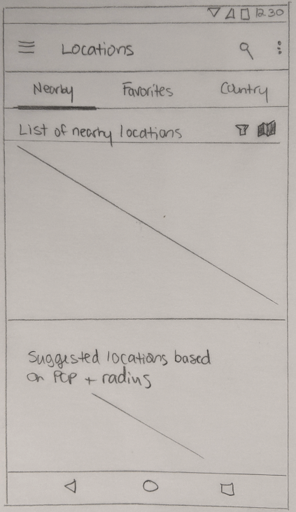
Locations Screen (List)
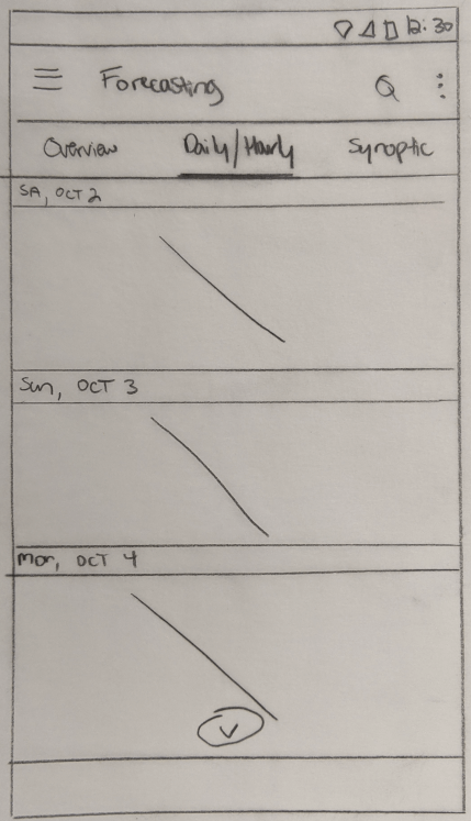
Daily/Hourly Screen
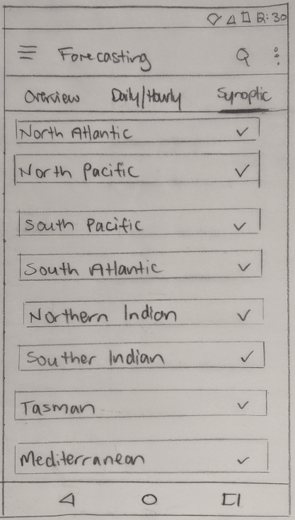
Synoptic Charts
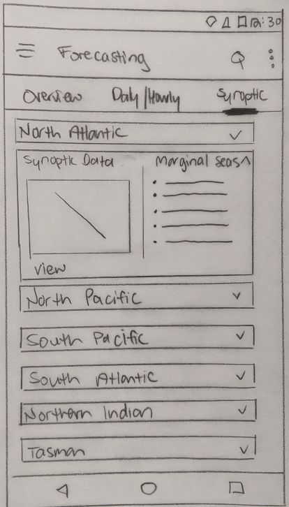
Marginal Seas
Synoptic Pull-Downs
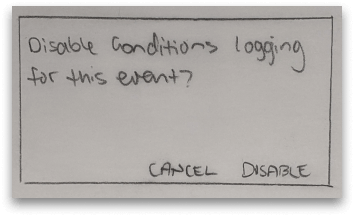
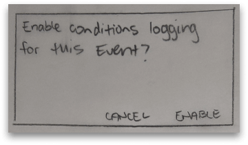
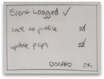
Conditions Logging Modals
Settings Pull Down
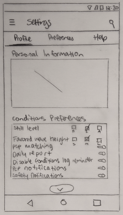
Settings Screen
Low-Fidelity Sketches - Desktop Version
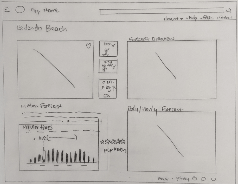
Forecasting/Home Screen
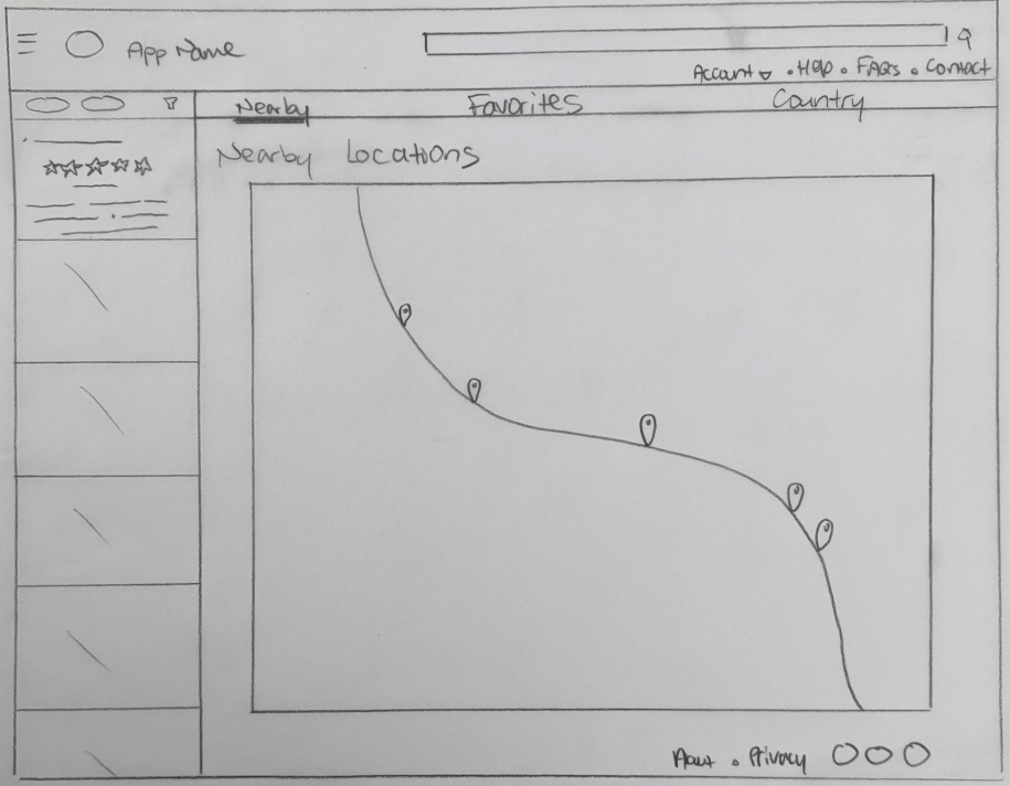
Locations Screen
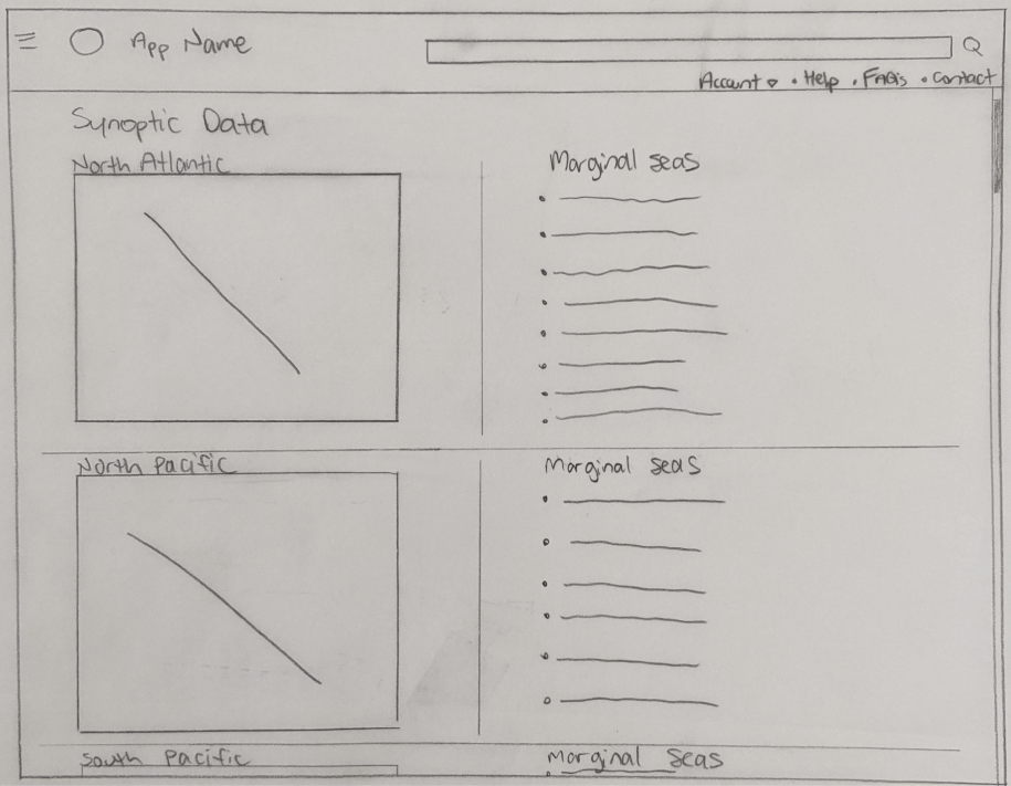
Synoptic Data
Synoptic Map
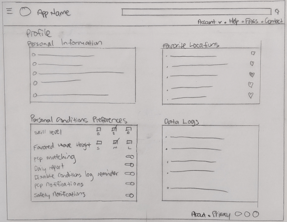
Profile/Preferences Area
Delivery
Wire-Framing
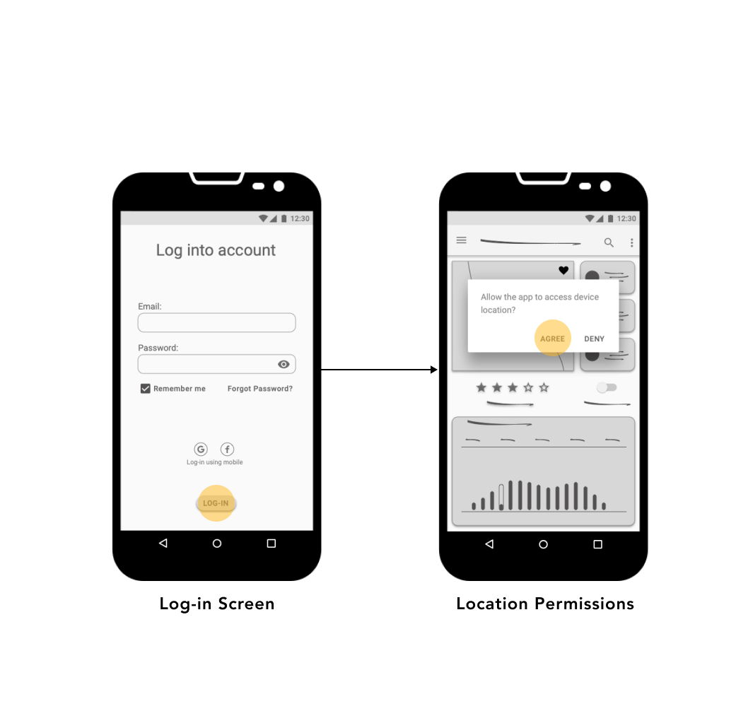
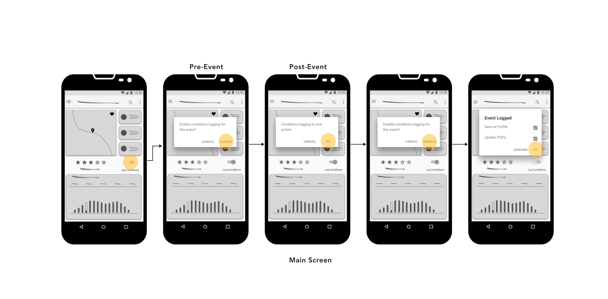
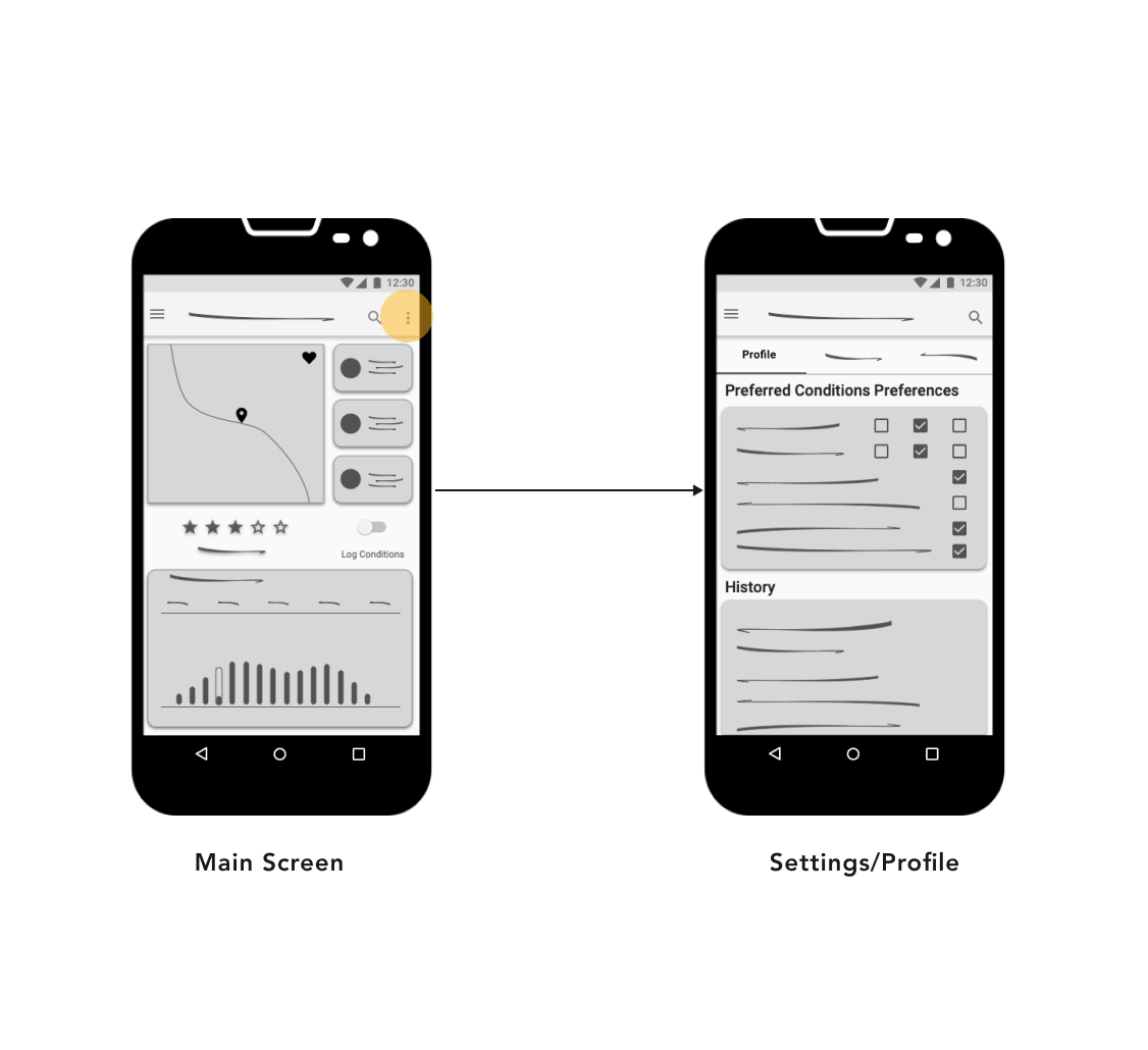
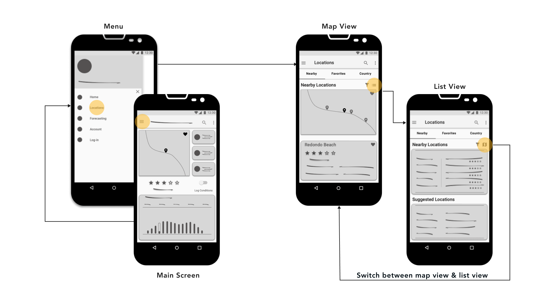
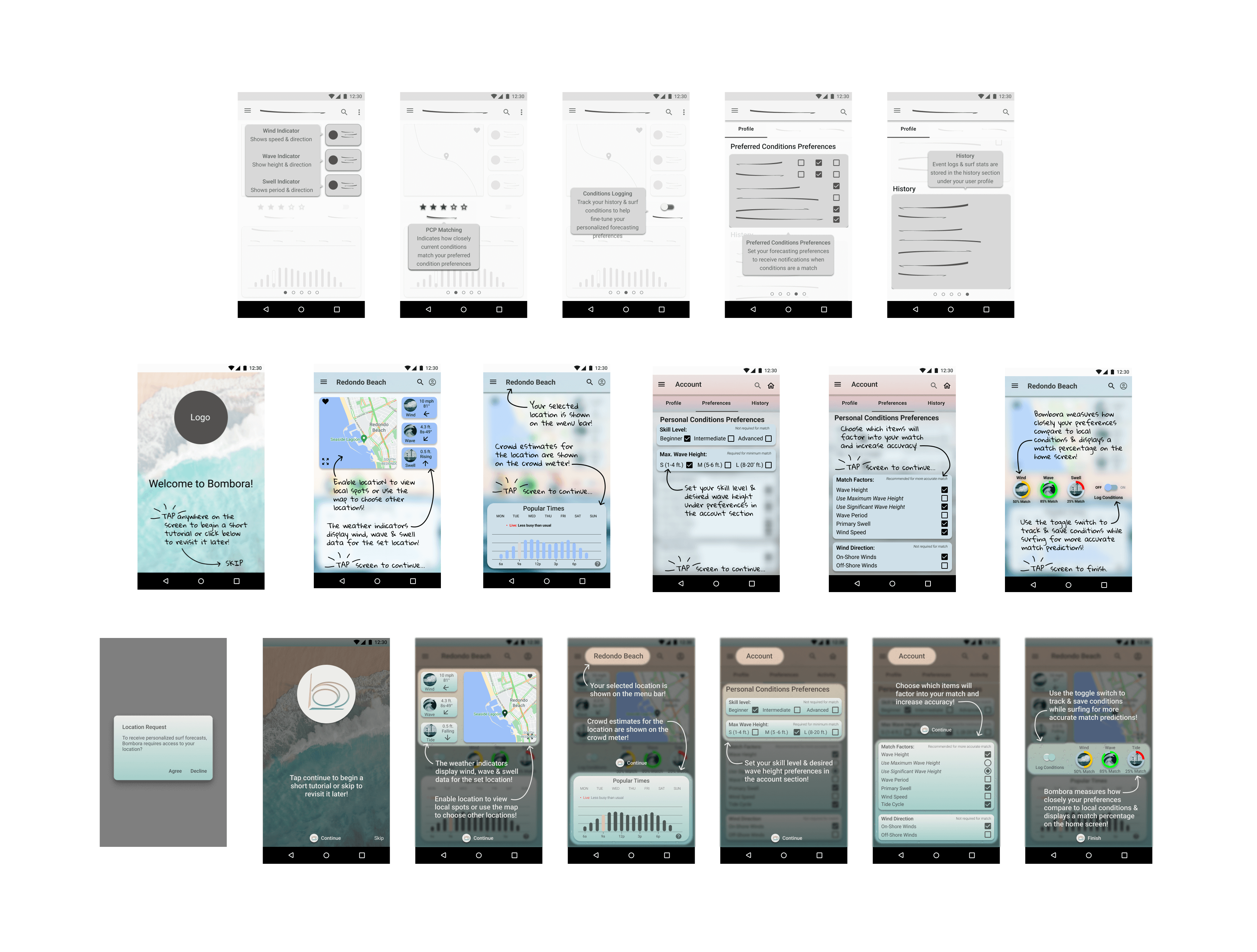
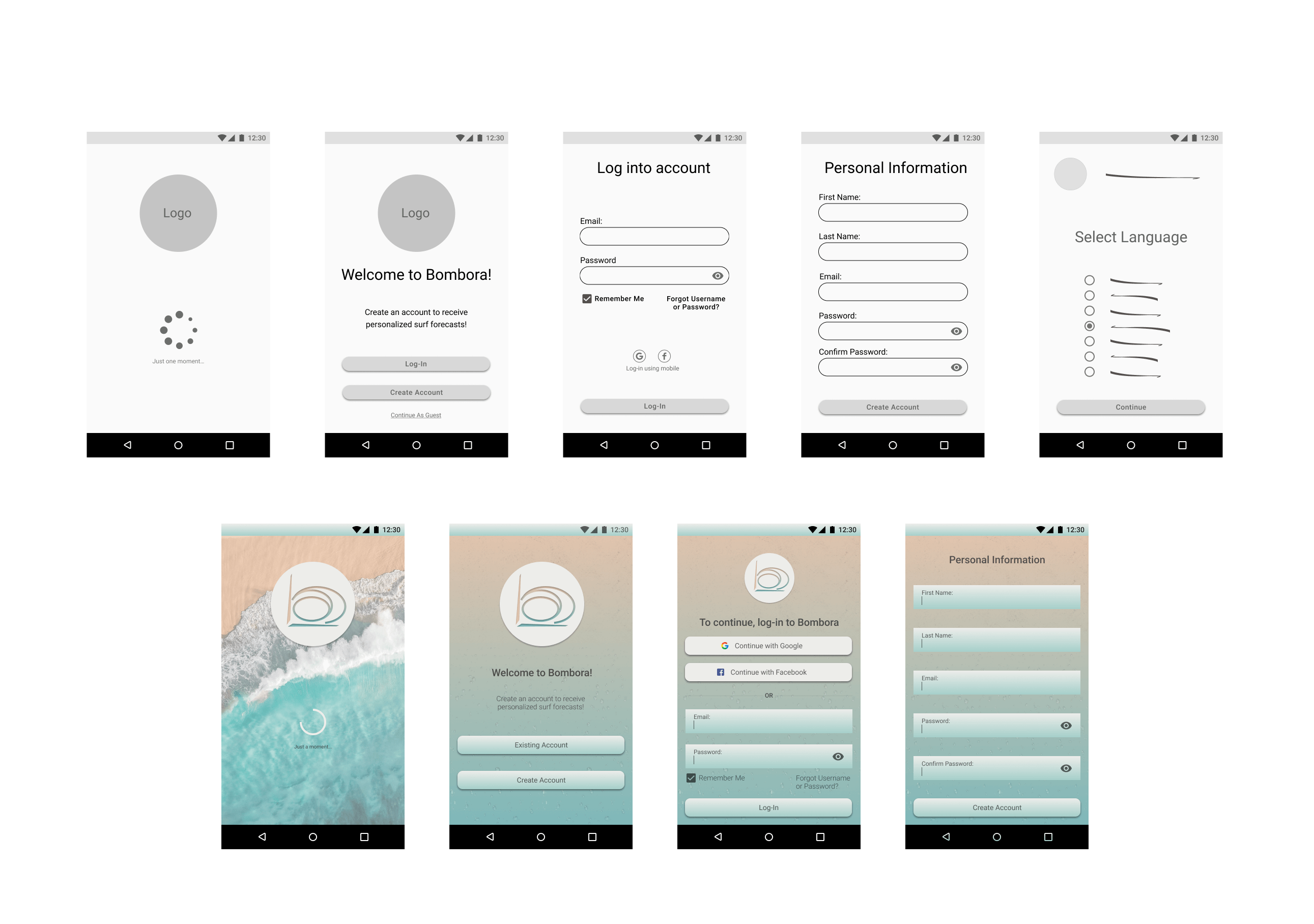
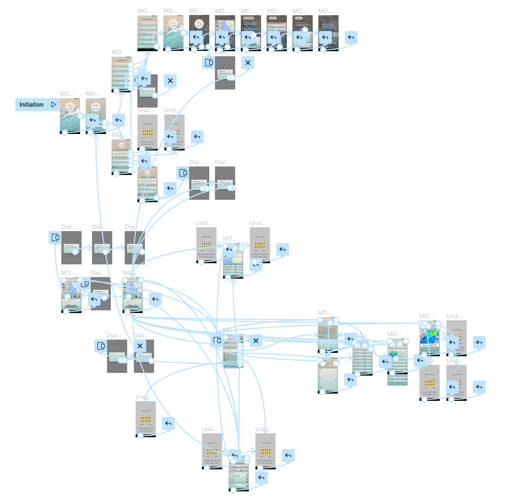
With high level visuals for the structure and functionality of Bombora completed, translating the low-fidelity sketches into mid-fidelity format using Sketch’s design tools to create the various interface elements helped visualize the overarching concept for how the app might operate and the placement of UI elements without too much detail. The wireframes were then arranged as static visuals using annotations, connector arrows, and interaction highlights to demonstrate the true interactivity and flow for the various core features within the application.
Mid-Fidelity Wire-Frames
Usability Testing
To evaluate the success rate regarding app learnability and memorability among experienced users and new users alike, a usability test was conducted to assess the efficiency of the app’s main forecasting functions, recognize and record any errors encountered during use, and gauge the overall user satisfaction in areas like navigation, content, use of language layout, and UI. The following test objectives were considered:
Comprehension
Assess how easily users are able to comprehend, absorb, and retain proficiency in navigating the application’s interface.
Personalization
Determine to what degree the PCP and Conditions Logging functions meet the needs of users.
Utilization
Determine how users prefer to utilize the weather forecasting tools, surf indicators, synoptic information, and location functions.
Appeal
Obtain feedback regarding the app’s overall appeal and degree of usability with respect to content, navigation, UI, and use of language.
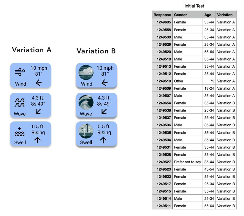
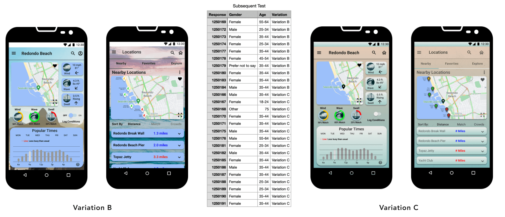
High-Fidelity Prototyping & Preference Tests
With usability testing complete and a solid set of wireframes to work from, it was time to bring the design to life. Two variations of the interface were developed for some of the main screens as high-fidelity prototypes, one being an overall theme using color variations, the other using surf-related imagery, experimental weather icons, and alternate fonts. The prototypes were presented to users for preference testing via Helioapp using a set of choice based criteria and instructions for comparing variations of the wireframes and icon options side by side. Initial testing resulted in participants favoring image style icons and subsequent testing resulted in a preference for the overall themed design.
Design Evolution & Styling
Focusing on the aesthetics required for the themed option, an initial style guide was developed to improve the UI and create a visually appealing brand to complete the user experience containing color, typography, and the overall styles to be used throughout the application. The main design principles applied comprised of:
Proximity & Similarity
By combining common themed items within their own respective boundaries users naturally associate them as a unit and their relation to one another.
Common Fate & Hierarchy
Expandable content segments indicate they are grouped and order of importance is demonstrated in a top-down fashion depending on the category selected.
Balance & Proportion
Informal balance distributed the visual weight of the elements demonstrating equal importance and the shape combinations serving a cohesive purpose.
Hierarchy & Emphasis
The visual contrast created by tint and blur techniques is highly effective in drawing the users attention to the specific elements called-out via the corresponding coach marks.
Design Evolution
Design Language System
Using the style guide and brand theme as a foundation, a comprehensive design language was ultimately developed for the entire Bombora product as a means of governance containing all design standards and rules for their application within the user interface across multiple platforms.
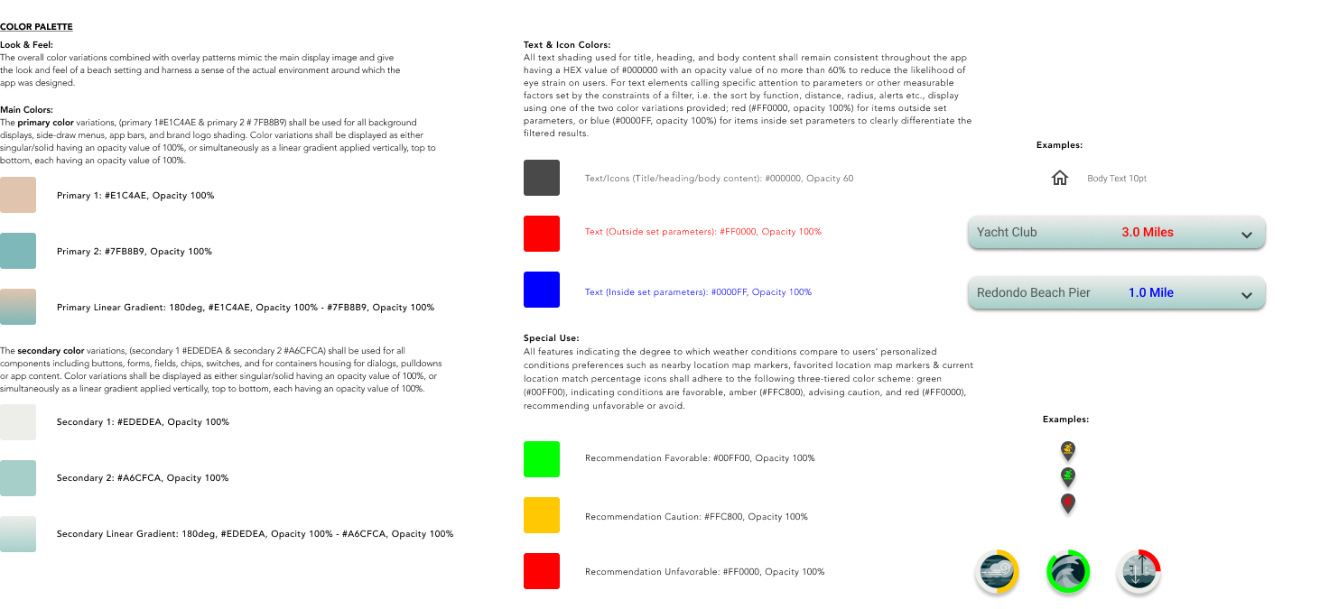
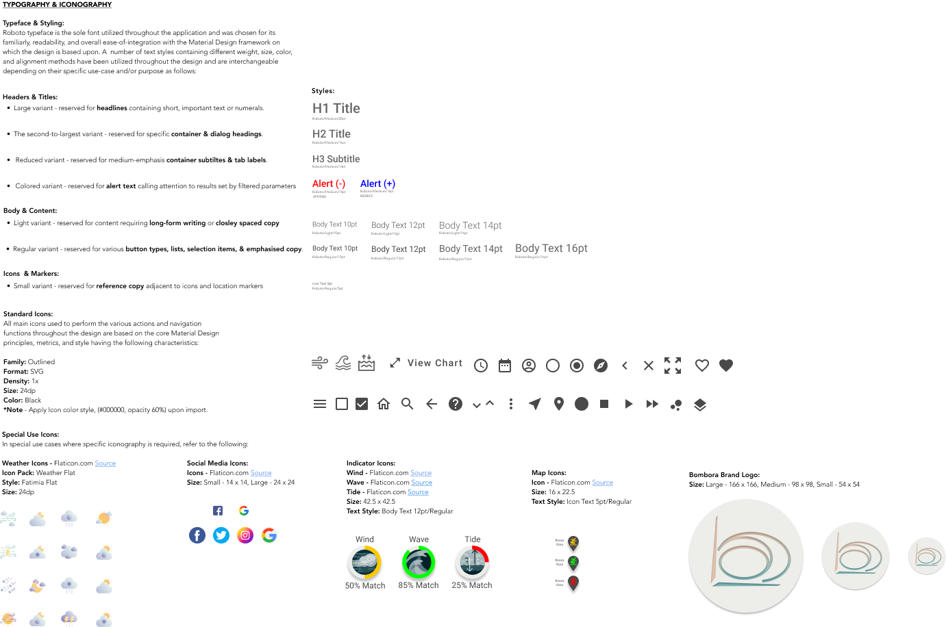
Accessibility Considerations
Over the course of the design several important accessibility items were addressed by evaluating the design against the Web Content Accessibility Guidelines (WCAG) accessibility guidelines and ranking them according to their level of compliance (A, AA, or AAA). Bombora's goal was to comply, at a minimum with either the A and/or AA level requirements, and the AAA level requirement in areas when possible. To obtain compliance the following revisions were implemented:
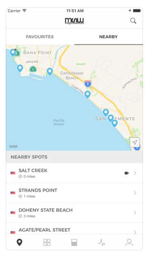
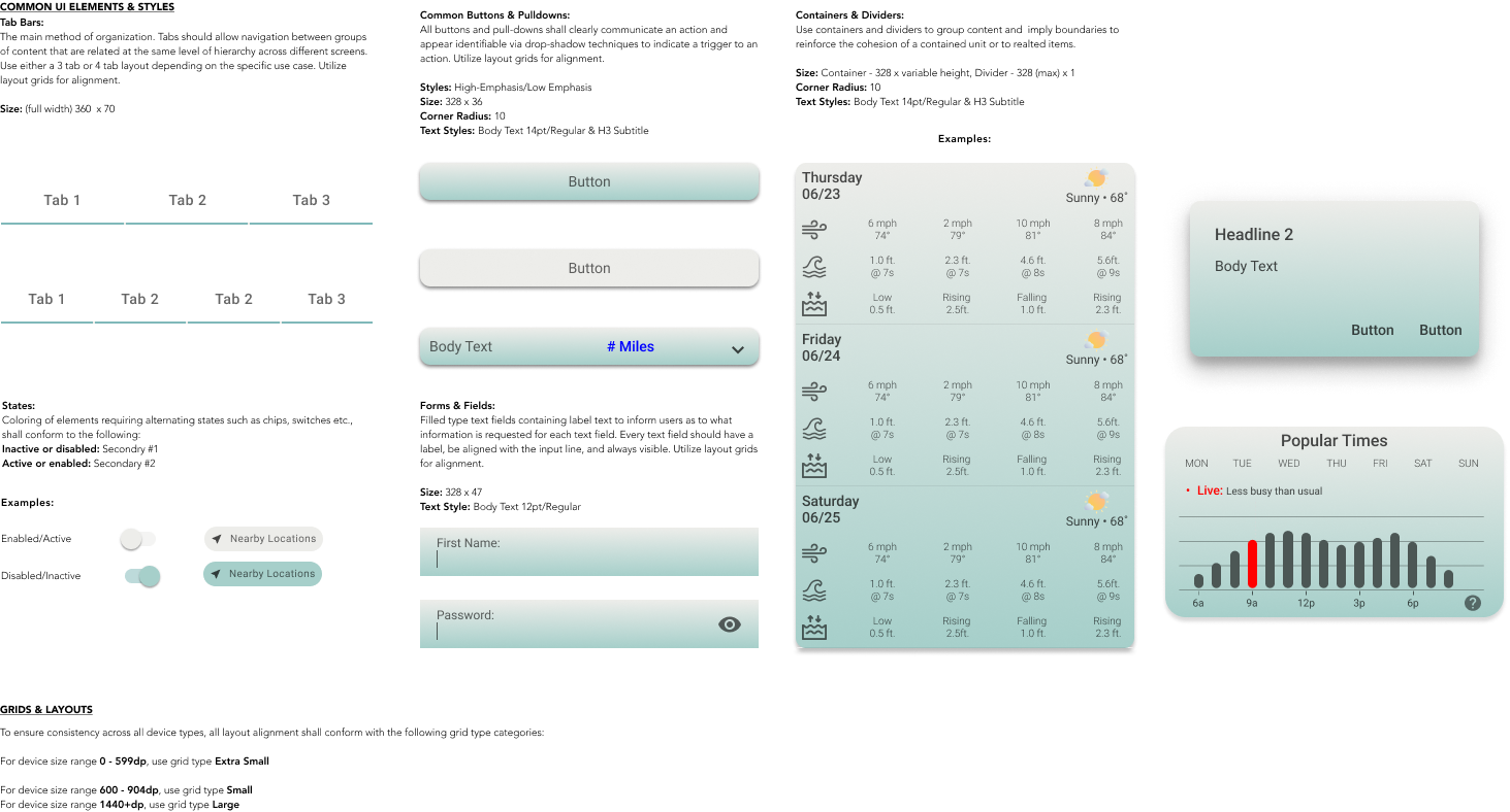
Location Icons
- Better visual contrast between the three color categories and the location icon
- Improved visibility when viewing multiple location icons using a small device
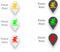
Side Draw Menu
- Better contrast the selected item against the background color
- Enhanced the visibility of the darker text component within
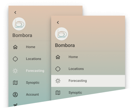
Wind, Wave & Swell Indicators
- Gradients and shadows removed for improved contrast
- Unnecessary shapes and polygons removed for visual clarity
- Icons reduced to a single layer to limit clutter
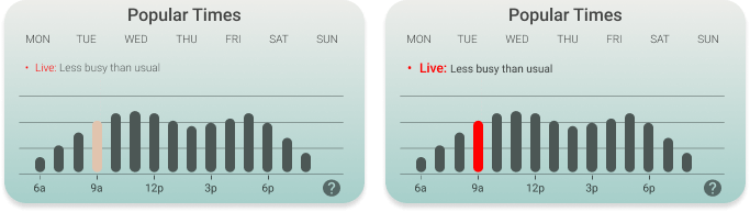
Crowds Graph
- The time-frame indicator color to match that of the text “Live” feature from the main palette
- The “Live” text revised to a larger font and bolded to meet visibility guidelines
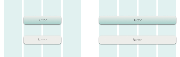
Buttons
- Buttons were revised to span the extents of the layout grid making the action more accessible for use with one hand on small device types
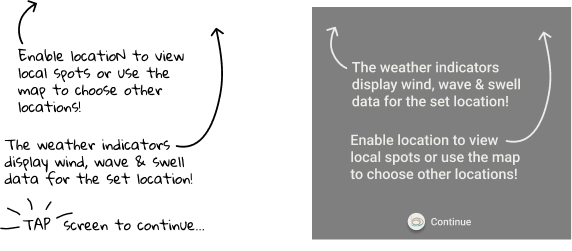
On-Boarding Fonts
- Font style revised to be consistent with the font used throughout the application
- Font color revised to match palette color Secondary 1
- Darker scrim applied to enhance visibility of instructional text
- Continue button more clearly indicated clearly indicated
Text & Icon Opacity
- Opacity value revised to 71% for minimum AA rating three categories: Normal Text (AA), Large Text contrast vs background (AA + AAA), Graphical Objects (AA)

Putting It All Together
With the majority of the main design deliverables an design language completed, an updated interactive prototype and set of 3D mock-up’s were created using Figma to present Bombora to various audiences offering a realistic sense into how the application will function and feel, and for use in future testing and planning for further iteration drawing the product closer toward completion.
Click to view the interactive prototype
Product Mock-Up's
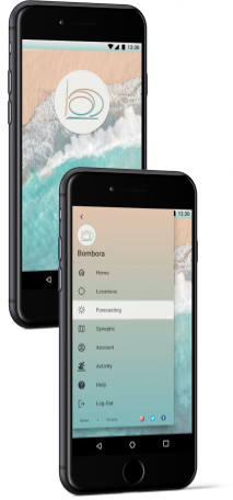
Splash & Menu Screens
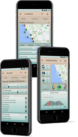
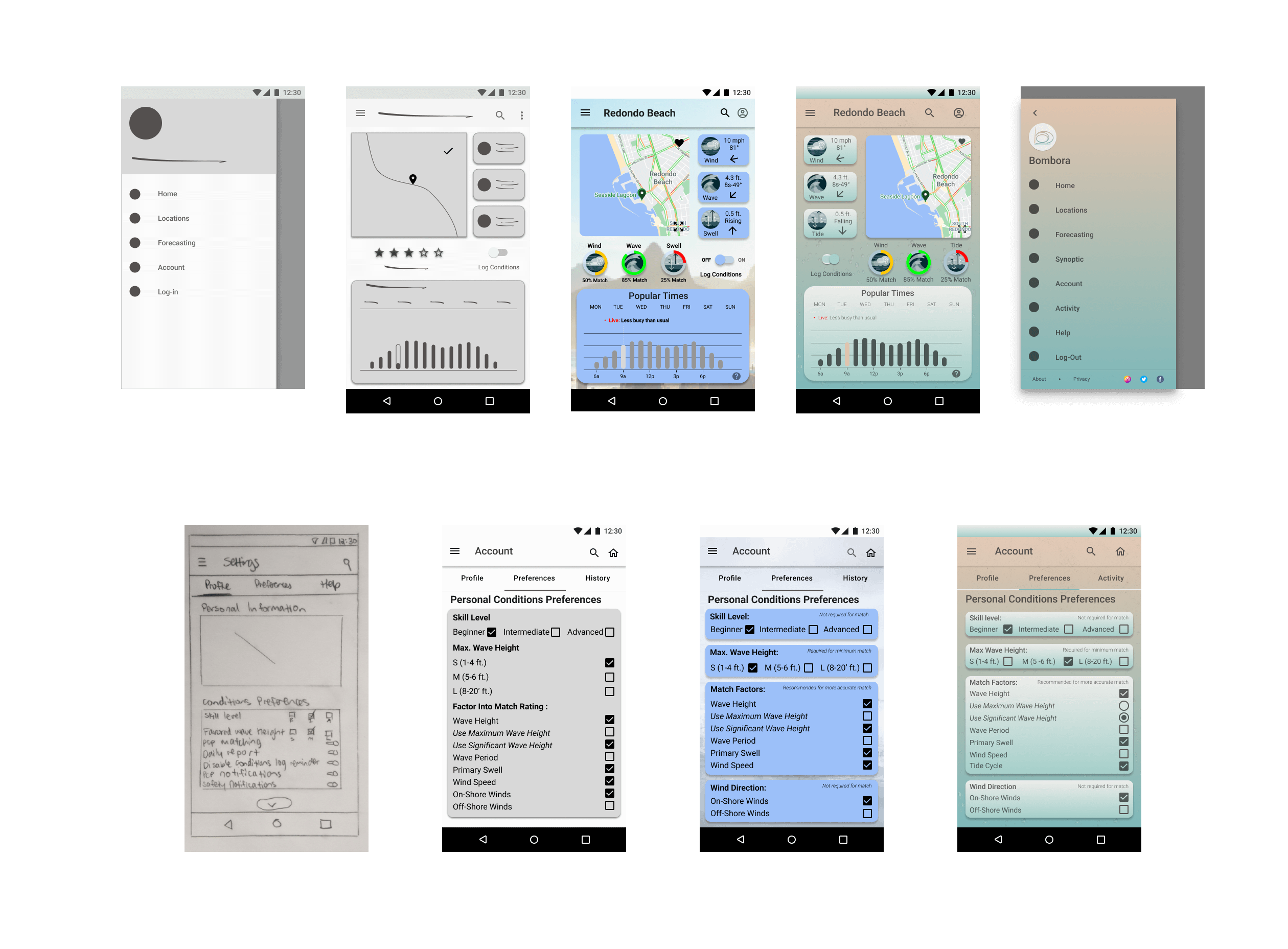
Forecasting & Account Screens
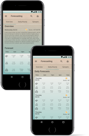
Daily Forecasting & Overview Screens
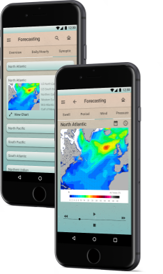
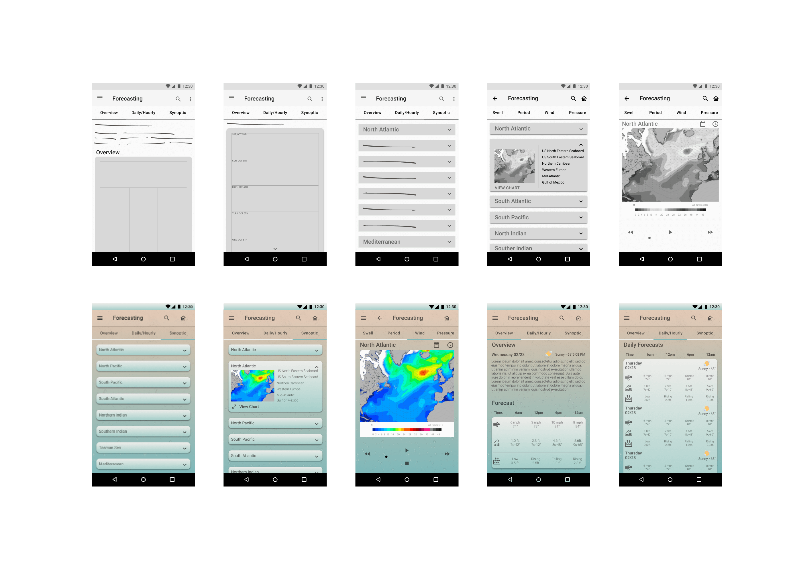
Synoptic Screens
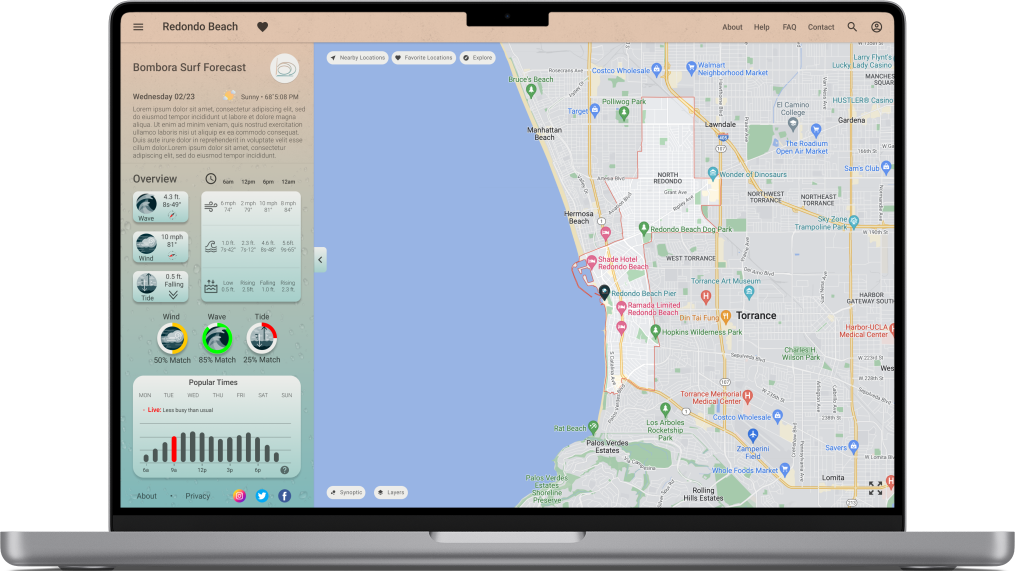
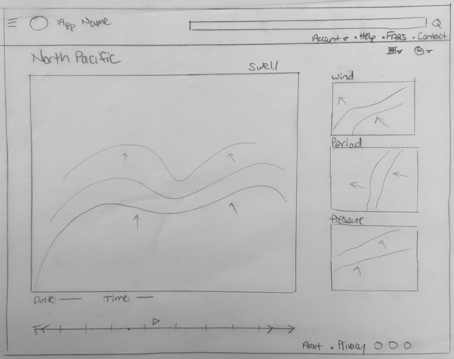
Forecasting Screen - Desktop
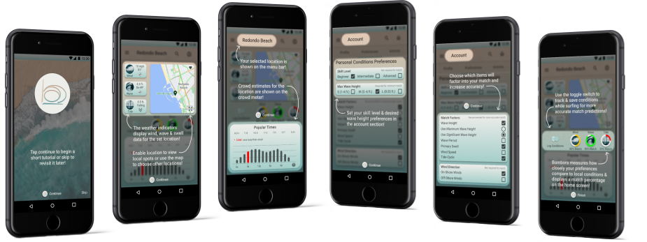
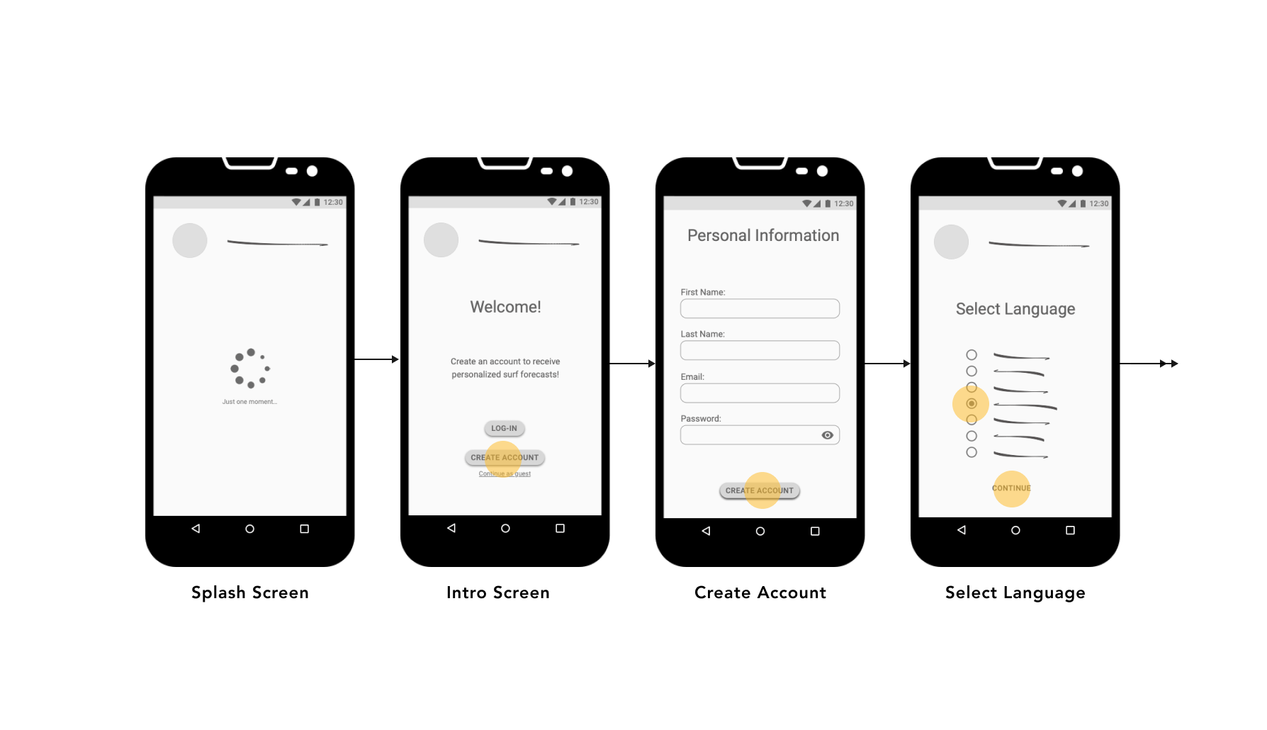
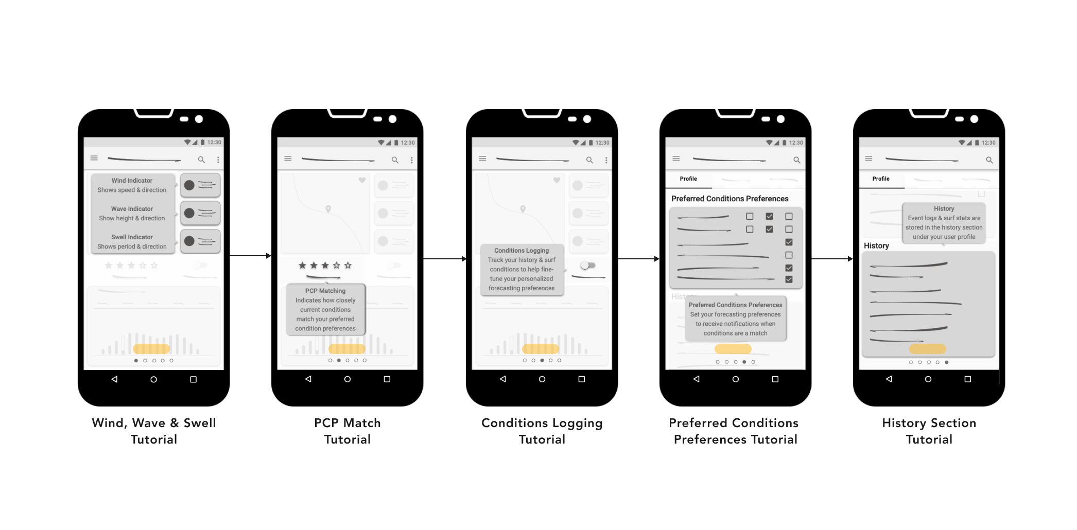
On-Boarding Experience
Next Steps
In the coming months upon graduating from my CareerFoundry studies, I intend to bring the Bombora Surf Forecasting application to completion focusing on several areas requiring specific improvements or additional research and ideation to evolve including:
Final Reflection
Pursing design for the Bombora Surf Forecasting app for my student project not only allowed me to graduate with my UX Design Immersive Certification, but granted fulfillment of my personal journey into the world of technology and user experience. The overall experience has led to significant professional growth and learning opportunities such as:
- Learning industry tools, and technical competencies, while honing my interpersonal skills for use across the UX design-thinking spectrum
- The talk of the trade. Industry jargon and technical terms commonly referred to throughout the technology sector and product design world
- How evidently UX design-thinking and associated skills are translatable from those used in other industries
- Feedback and insights are still two of the greatest means toward professional growth
- My interpersonal skills will offer great value in building relationships and driving momentum in my career choice
- The beauty of technology and the endless possibilities it offers us to improve our world
- A new appreciation for the human experience, its value, and why it matters in the lives of all of us